Achieving a successful modern vintage kitchen design without veering into the realm of kitsch demands the strict application of an 80/20 balance ratio. This fundamental principle dictates that 80 percent of the room’s architecture should be built upon a functional, clean, and modern foundation. The remaining 20 percent is then strategically injected through carefully curated classic accents, such as unlacquered brass cabinet hardware, fluted glass pendant lights, and functional ceramic displays. In contemporary homeownership, kitchen design has ascended to a paramount priority, reflecting a broader trend towards spaces that are both aesthetically pleasing and highly practical. This cornerstone guide, developed by architectural and interior design experts, will technically dissect the process of curating both hard and soft elements for your culinary space, ensuring long-term investment value over fleeting social media trends.
The 80/20 Principle: A Foundation for Timeless Design
The reluctance many homeowners feel when attempting to merge two drastically different design eras—the sleek modernity of today with the nostalgic charm of yesteryear—is understandable. However, this apprehension is unnecessary when one masters the foundational principles of structural decorative element arrangement. The 80/20 rule, a well-established heuristic in design, provides a robust framework for blending styles harmoniously. The 80 percent modern base typically encompasses clean-lined cabinetry, efficient contemporary appliances, and a streamlined layout that prioritizes ergonomics and functionality. This modern canvas ensures the kitchen remains relevant and highly usable for daily tasks, meeting the demands of 21st-century living.
Conversely, the 20 percent vintage infusion acts as the soul of the space, preventing it from feeling sterile or generic. This smaller percentage allows for impactful, high-quality vintage elements to shine without overwhelming the modern framework. The goal is to create a space that feels "collected over time," as if elements have been thoughtfully acquired across generations, rather than a single, thematic purchase. Our recommendations are rigorously vetted against verified interior architecture standards, focusing on designs that build lasting investment value. We aim to guide you in constructing your dream culinary space with the precision of a seasoned professional, steering clear of ephemeral social media trends.
Architectural Hardware: The Jewelry of the Kitchen
Cabinet hardware, often referred to by architects as the "primary jewelry of the kitchen," exerts an extraordinarily massive visual impact. These seemingly minor elements are numerous and positioned at eye level, making their selection critical. Choosing classic kitchen cabinet handles with proportional forms is not merely an aesthetic choice but a strategic one that defines the vintage character.
-
Unlacquered Brass: A Living Finish: The pinnacle choice for embodying a true vintage aesthetic lies in unlacquered brass. Unlike modern factory brass, which is coated with a protective lacquer to prevent tarnishing, this material is left "naked" and allowed to "live." It reacts chemically to atmospheric moisture and the natural oils from human touch, initiating a process of oxidation. Over months and years, this natural oxidation creates a stunning, unique patina. The metal surface gradually darkens, developing an antique bronze hue that no factory finish can replicate. This organic aging process injects the soul of the past into your modern cabinet fronts. Each drawer pull will develop a highly personal and unique wear pattern, telling a story of use. When sourcing hardware, ensure product specifications explicitly state "unlacquered" or "living finish." Opting for regular lacquered brass will only result in a perpetually cheap-looking, shiny finish for decades.
-
Cup Pulls: Victorian Ergonomics: For wide lower cabinet drawers, half-cup shaped pulls offer a perfect silhouette. This hardware design originated in late 19th-century Victorian England, gaining popularity in apothecaries and hardware stores due to their ease of grip. The elegantly curved form of cup pulls provides a charming visual contrast, particularly when paired with the straight, rigid, and precise lines of Shaker-style cabinet doors. Proportion is paramount; never select overly diminutive pulls for heavy pot-and-pan storage drawers. Industry standard recommends at least a 10-centimeter cup pull for a standard drawer. For drawers exceeding 60 centimeters in width, installing two pulls in parallel effectively distributes the load and enhances visual balance.
-
Cabinet Latches: A Tactile Nod to the Past: To elevate the nostalgic charm to its maximum, consider incorporating turn-style cabinet latches, particularly on upper cabinets or those storing fragile items. This mechanical locking mechanism produces a satisfying "click," offering a unique tactile sensation. Latches evoke the traditional "icebox" refrigerators of the pre-electric era, adding an authentic layer of historical detail. However, their placement requires careful consideration as they necessitate a two-step opening process. Avoid installing latches on waste bin cabinets or spice storage areas where quick, single-handed access is frequently needed.

-
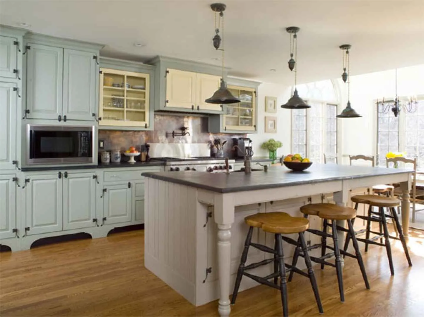
Matte Black and Polished Nickel: Versatile Alternatives: If the inherent luster of brass feels too prominent, wrought iron finished in matte black offers an excellent alternative. Matte black anchors the room’s aesthetic towards a more masculine, industrial, and robust direction, reminiscent of historic European farmhouse kitchens. The key to avoiding a generic look lies in the tactile texture of the iron; seek hardware that displays slight hand-forged imperfections rather than perfectly smooth, plastic-like castings. Pair these black handles with exposed cabinet hinges to amplify an authentic vintage character. Another metal alternative is polished nickel, which offers a significantly warmer tone than pure chrome. Polished nickel possesses a subtle yellowish undertone, imparting a luxurious, aged silver appearance. This material is ideally suited for French bistro-inspired kitchens aiming for a clean yet historically resonant presentation.
Illuminating the Past: Retro Lighting Fixtures
Lighting holds profound psychological control over a room’s ambiance, especially after sunset. Relying solely on recessed LED downlights will fail to achieve a characterful atmosphere. Retro kitchen pendant lights play a crucial role as functional sculptural art within your line of sight, contributing significantly to the desired vintage aesthetic.
-
Schoolhouse Opal Glass Pendants: The schoolhouse design is a quintessential representation of 1920s American public architecture. Originally conceived for libraries and school classrooms, these lamp shades were designed to diffuse the harsh glare of early light bulbs into a soft, evenly distributed glow. The shades are typically crafted from thick, milky white opal glass with a distinctive rounded silhouette, often featuring hand-painted circular bands on their bellies. Placing a pair of schoolhouse pendants above a kitchen island instantly conjures a sense of familial warmth and historical continuity. Critical to their authenticity is the supporting material; opt for sturdy brass chains or solid iron stem mounts, avoiding flexible plastic cords that undermine the historical integrity of these distinguished fixtures.
-
Fluted Glass Pendants: Bridging Eras: Fluted or ribbed glass offers a sophisticated vertical architectural texture. The linear texture of the glass refracts light and subtly obscures the light bulb within, intelligently bridging the transition from early 20th-century Art Deco style to contemporary minimalism. The significant advantage of fluted glass is its ability to maintain an open, uncluttered feel. Unlike solid metal shades that block sightlines, textured glass allows for visual transparency, preventing the room from feeling visually fragmented by the weight of the fixtures. Pair these transparent glass shades with oil-rubbed bronze fittings. This combination evokes the nostalgia of European bistros, prioritizing visual clarity while reflecting dramatic striped shadow patterns onto the ceiling at night.
-
Articulating Sconces: Layered Task Lighting: Beyond primary illumination, introduce accent lighting layers with articulating sconces. Install these brass wall-mounted lamps, with their bendable jointed arms, directly above a sink window or over open wooden shelves to highlight ceramic displays. These early 20th-century industrial-style wall lights brilliantly break up blank wall spaces. Besides providing specific task lighting for food preparation areas, they add spatial dimension, reinforcing the impression that your kitchen’s lighting system was designed by a professional with a multi-layered approach.
-
Color Temperature (Kelvin): The Decisive Factor: A common mistake that undermines all investment in lighting fixtures is selecting the wrong bulb temperature. Modern LED bulbs are often sold with "daylight" or "cool white" temperatures (above 4000 Kelvin). This bluish-white light will transform your kitchen into a sterile, hospital-like operating room. Cold light instantly kills the warmth of wood grains and makes brass appear like cheap plastic. World-class lighting designers unanimously recommend a color temperature in the 2700K range. This produces a "warm white" that faithfully replicates the soft glow of traditional incandescent bulbs, enriching the textures of exposed brick and solid wood. Moreover, food presented under 2700K light appears significantly more appetizing. Always incorporate dimmer switches to adjust light intensity according to evening requirements.
Curating Accents: The Art of Restrained Vintage
Arranging decorative accents demands strict discipline and self-restraint from the designer. Your primary objective is to create a room that appears to have been slowly "collected over time," never resembling a bulk purchase from a single furniture catalog page. Non-kitsch kitchen accents must primarily serve a practical, daily purpose. Objects that function solely as static displays carry a high risk of making the kitchen feel like a souvenir shop.
-
Faded Turkish Runner Rugs: A well-kept secret among interior designers for softening the rigid atmosphere of a kitchen is the deployment of a runner rug. The narrow, elongated space between the main cabinets and the kitchen island often feels cold and hard. Rolling out a vintage woven rug instantly dampens echoes and pampers the soles of your feet. Opt for authentic Turkish or Persian rugs with time-worn, faded hues. These rugs introduce organic patterns, layered colors, and a strong historical narrative to the floor, providing an effortless way to break the dominance of straight lines in your cabinetry. Many modern individuals worry about carpets quickly succumbing to grease splatters or cooking stains. However, authentic vintage wool rugs possess exceptional resistance to moisture and dirt. Their complex patterns are specifically designed to conceal minor imperfections, making them highly functional in a workspace.

-
Open Shelving: A Statement of Curated Elegance: Replacing some of the massive upper cabinet runs with open wooden shelving is a clever design strategy. Thick, solid wood planks, such as white oak or teak, directly introduce natural elements into the home. The organic texture of the wood grain is crucial for balancing the cold surfaces of stone countertops. Mount these wooden planks using sturdy brackets made of cast brass or simply patterned wrought iron. However, strict curation is essential for items placed on these shelves. Open shelving is unequivocally not the place to hide plastic cereal boxes or promotional mug collections. Arrange stacks of handmade ceramic plates in a neutral, cohesive color palette. Place large glass jars for dry pasta and wooden bowls filled with fresh lemons. Limit display object colors to earthy tones to prevent visual stress from clutter.
-
Copper and Earthenware: Functional Nobility: To ensure the design remains free from kitsch, discard any wooden signs carved with "KITCHEN" or "EAT." Such literal objects that dictate a room’s function are antithetical to high-end design. Instead, showcase functional cookware made of noble metals or authentic ceramics. A collection of solid copper pots, hung on an iron pot rack, offers an old-world luxury reminiscent of professional classic French kitchens. The reddish hue of copper, reflecting light, injects a sense of culinary prestige. Juxtapose this metallic gleam with the rough texture of earthenware. Utilize large terracotta pitchers as holders for spatulas and wooden spoons beside your commercial-style range. Position a heavy stone mortar and pestle in a corner of your workspace. These weighty, functional objects emphatically declare that this area is dedicated to the serious art of cooking.
-
The Touch of Fine Art: The final, surprising element to mature this concept is the inclusion of framed fine art in the kitchen. This area is often overlooked for artistic embellishment due to concerns about cooking vapors. Displaying a vintage oil painting on canvas (such as a natural landscape or a fruit still-life) will dramatically alter the room’s perception. Lean a framed, distressed wooden painting on an open shelf, alongside a stack of plates. Traditional artwork instantly reduces the "utility" quotient of the space, elevating it into a full-fledged "living space." This seamlessly bridges the transition between family and dining areas.
Surface Aesthetics: Backsplashes and Countertops
Working surfaces, including the backsplash and countertops, command a dominant visual percentage of the kitchen. The choice of materials here dictates the room’s character, determining whether it leans towards a rigid contemporary apartment or an elegant, historically infused dwelling.
-
The Imperfection of Zellige Tiles: Move beyond generic, factory-made white subway tiles, which have become increasingly monotonous. Elevate your material standards with authentic Zellige tiles, manually pressed by Moroccan artisans. Traditional firing methods ensure that each tile possesses a unique thickness, color, and texture that is impossible to replicate identically. When these Zellige pieces are installed tightly against the wall without thick grout lines, a visual marvel unfolds. Their surface creates an organic, undulating effect that dynamically and captivatingly reflects light. This surface imperfection is the primary weapon against the monotony of straight cabinet lines. Choose a calming, neutral color palette such as off-white, grayish pearl, or faded olive green. Allow the texture of the ceramics to dominate the room, rather than bright colors. The wavy surface of Zellige injects a human soul into a kitchen surrounded by modern electronic appliances.
-
Timeless Stone: Carrara Marble and Soapstone: No earthly material better represents past luxury than natural marble. Carrara or Calacatta marble, with their distinctive dark gray veining, provide the most perfect canvas. A slab of natural stone on a kitchen island can instantly elevate the room’s social status. Modern society often exhibits a phobia towards marble due to its porous nature and susceptibility to acid etching. However, within the philosophy of modern vintage design, lime juice stains and subtle scratches over time are not considered defects. These traces of daily use are appreciated as a "patina" that records the life and history of your family. If you desire a more resilient and darker natural stone, soapstone is the champion. This deep black stone with fine white veins is a historic countertop material in America. It is resistant to acids and extreme heat, making it ideal for pairing with light-colored cabinetry.
Cabinetry Color Palettes: Beyond Sterile White
The paint color on cabinet doors acts as the outer skin that instantly defines the room’s mood. Leading designers are gradually moving away from the "hospital-white" kitchens that can be visually jarring. Instead, seek hues with a gray undertone to evoke the character of traditionally mixed paints.
-
Botanical Hues: Sage Green and Slate Blue: Colors inspired by the natural world consistently harmonize with vintage objects. Sage green, with its blend of gray and yellow pigments, offers an unparalleled calming effect. This dusty hue provides the most harmonious backdrop for showcasing the golden luster of your brass hardware. An equally beautiful deep color alternative is slate blue, a grayish blue reminiscent of natural slate. This blue tone is far removed from any childish or garish primary colors. Faded cabinet hues dampen aggressive light reflections, creating a visual depth characteristic of country estate kitchens.

-
Creamy White and Mushroom Tones: Warm Neutrals: For those who insist on a bright kitchen, avoid pure white with bluish undertones. Instead, select a more soothing color spectrum such as off-white, ivory, creamy beige, or greige (gray-beige). These warm-toned colors capture natural morning light much more gently. Beyond being softer on the eyes, mushroom or creamy-colored cabinets cleverly conceal dust and fingerprints, unlike glossy white surfaces that demand constant daily cleaning. You can also implement a two-tone concept by painting lower cabinets in a darker shade (blue/green) and upper cabinets in a creamy tone.
Seamless Integration of Modern Appliances
The most significant visual challenge in designing a retro space is the presence of massive, boxy electronic technology. A giant stainless steel refrigerator, reflecting its surroundings, can easily shatter the illusion of the past, instantly reminding occupants of the 21st century.
The most elegant architectural solution to this crisis is the application of panel-ready appliances. This system allows you to affix custom-ordered wooden door panels directly over refrigerator and dishwasher doors. Your modern appliances will seamlessly disguise themselves as part of a graceful wooden cabinet run. For the main cooking station, however, invest in a commercial-style range. Choose a heavy-gauge steel body with oversized mechanical metal knobs on the front. Such a robust, "worker-class" stove should be prominently exposed, serving as a dignified architectural centerpiece in the room.
Strategic Sourcing: A Buyer’s Guide to Authenticity
Executing this blended design requires you to be an exceptionally skeptical, meticulous, and educated consumer. You will be bombarded by thousands of e-commerce algorithm products labeled "vintage retro," the majority of which will detract from your home’s aesthetic. Follow this strict purchasing protocol to prevent renovation budgets from being wasted.
Firstly, perform a direct physical weight test on every piece of hard material you intend to buy. When selecting drawer pulls or faucets, weigh the item in your palm. If it feels light and insubstantial, it is almost certainly made of hollow zinc or cheap aluminum. Genuine solid brass items are notably heavy and dense.
Secondly, critically study metal finishing terminology before clicking the purchase button. Strongly reject products with a "gold" finish that appears brightly, intensely yellow, like turmeric. Seek hardware with descriptions such as "brushed," "burnished," "tumbled," or "unlacquered," which guarantee a muted, art-worthy luster.
Thirdly, adhere to the noble principle of sustainable design: buy less, but buy the best quality. A single hand-woven runner rug and two authentic ceramic jars hold far more value than a basket full of mass-produced decorative items. Appreciate the presence of empty space (blank walls), as your eyes also require areas for rest.
Addressing Common Concerns: FAQ Integration

-
Daily Cleaning Efficiency: This blended style does not complicate daily cleaning processes. As long as pure classic touches are applied to vertical accents (drawer pulls and overhead lights), floor and countertop cleaning remains as efficient as in a contemporary kitchen. Modern floor surfaces and flat wood panels are sweep and mop-friendly. Extra care is only required if you insist on natural marble, which is sensitive to acidic substances.
-
Total Cabinet Demolition: Demolition of existing cabinets is not always mandatory. If your modern cabinet frames are sturdy and feature flat Shaker-style doors, consider refinishing them. Simply hire a professional duco paint service to coat them in a sophisticated sage green. Once the paint cures, replace all modern handles with classic brass pulls, and witness a magical transformation.
-
Mixing Metal Finishes: This is an advanced technique highly recommended by expert architects. Forcing a single metal color throughout the entire space can make the design appear rigid and inexpensive, resembling a "promotional furniture package." Instead, utilize a maximum of three distinct metal types: brass for drawer pulls, polished nickel for faucets, and deep black iron for hinges and overhead lighting. This approach adds depth and sophistication.
Conclusion: Crafting Your Enduring Culinary Space
The process of designing a transitional space that converges two timelines is far more than merely replicating Pinterest visuals. It is a profound journey of curating the history of objects to harmoniously integrate them into the heart of your home. The discipline of applying the 80/20 blending ratio serves as a protective shield against the pitfalls of cheap, kitschy styles.
Every physical interaction, from brewing morning coffee to preparing an evening meal, should evoke sensory pleasure. Invest wisely in material elements capable of aging gracefully alongside your building’s lifespan. By meticulously applying this in-depth technical guide, you can confidently welcome the birth of a dream kitchen that radiates timeless charm, unparalleled functionality, and absolute freedom from the shadow of kitsch.
This article was compiled by the board of interior and architecture experts at InteriorDesign.ID. We emphasize a structural technical approach and principles of high-quality material integrity. Our mission is to ensure your home investment is not only captivating through a camera lens but capable of enduring across decades.