 Lina Irawan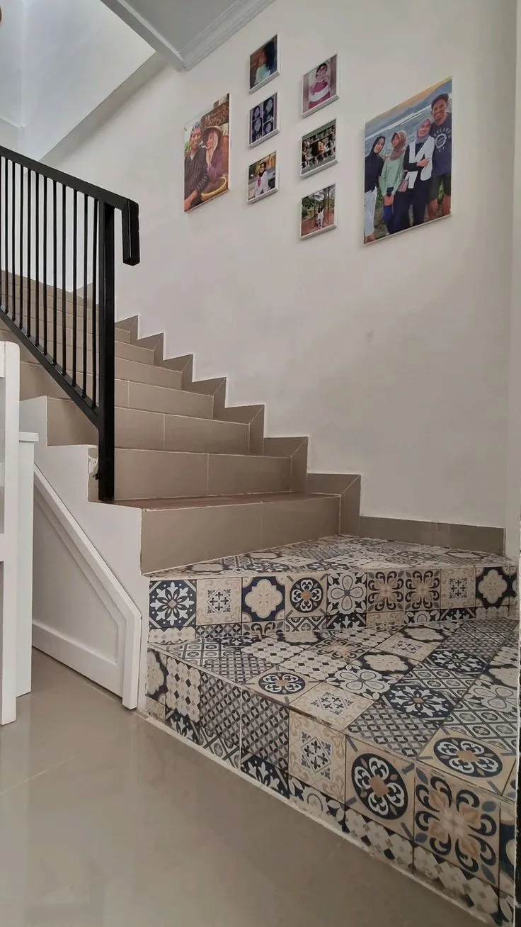
Achieving a cohesive and aesthetically pleasing interior space hinges significantly on the judicious selection and combination of floor and wall tiles. The fundamental principle guiding this design endeavor is the establishment of a singular focal point, allowing other elements to recede into a supportive role. When walls feature intricate patterns or vibrant designs, the floor should ideally remain understated, opting for solid, neutral tones. Conversely, if the intent is to highlight a striking patterned floor, such as classic encaustic tiles or sophisticated terrazzo, the walls should maintain a solid, unadorned appearance. This strategic approach is crucial in preventing visual clutter, which can lead to sensory fatigue and inadvertently make a room feel smaller and less inviting. Prior to any purchase, a thorough understanding of material scale, texture, and functional requirements is paramount. The choices made in tile selection profoundly influence the long-term comfort and visual appeal of a home, extending beyond mere aesthetic preferences to encompass practicality, durability, and the psychological impact of the living environment. Considerations should transcend immediate sales or discounts, delving into the room’s intended function, natural light exposure, and overall design narrative.
The Evolution of Tile Design: A Historical Perspective
Tiles have been an integral part of human architecture and interior design for millennia, evolving from rudimentary clay forms to highly sophisticated engineered materials. Ancient Mesopotamians and Egyptians utilized glazed bricks for decorative and protective purposes, while Roman and Byzantine empires perfected mosaic art, creating elaborate floor and wall patterns that conveyed status and spiritual narratives. Islamic art introduced complex geometric and calligraphic tilework, influencing design across continents. The Renaissance saw a resurgence of ceramic tiles in Europe, particularly in Portugal (azulejos) and Spain, often depicting intricate scenes or repeating motifs.
The Industrial Revolution marked a pivotal shift, making tiles more accessible through mass production. Victorian-era homes embraced decorative encaustic and geometric tiles, often combining multiple patterns in a single space, a practice that, while historically significant, sometimes contributed to visual overwhelm. The Art Deco movement brought sleek, geometric patterns and bold colors, while mid-20th-century modernism favored cleaner lines, larger formats, and a more subdued palette. Today, technological advancements in digital printing and material science have democratized bespoke designs and textures, allowing for an unprecedented range of options, from hyper-realistic wood and stone effects to innovative 3D textured tiles. This rich history underscores a cyclical return to principles of balance and harmony, where modern design increasingly emphasizes thoughtful combination over sheer abundance.
Establishing Visual Hierarchy: The Core Principle
The initial step in any successful tile combination project is to clearly define the room’s focal point. A common design pitfall is allowing both the floor and walls to compete for attention, inevitably resulting in a disorganized and unsettling aesthetic. To prevent this, patterned floor tiles should be reserved for spaces where walls are painted in solid colors or clad in simple, clean tiles, such as pristine white ceramics. This provides the eye with necessary "resting spaces" to fully appreciate the intricate details of the floor. Conversely, if the design intent is to feature a bold wall treatment—perhaps Moroccan-inspired tiles in a kitchen backsplash or an elaborate mosaic in a bathroom—the floor should be grounded with plain, muted tones like concrete grey or soft cream.

An important exception to this rule applies to exceptionally large spaces, where a deliberate clash of patterns can be executed successfully, provided there is a significant difference in scale. For instance, combining a very large, abstract pattern on the floor with a very small, intricate pattern on the walls can create a dynamic yet balanced interplay, preventing either from dominating excessively. This sophisticated approach requires a keen eye for proportion and an understanding of how patterns interact within an expansive volume.
The Strategic Trade-off: Floor vs. Wall Dominance
The concept of a "trade-off" in tile design does not imply sacrificing aesthetic quality in one area. Rather, it signifies a conscious allocation of visual emphasis, where one surface acts as a primary draw and the other as a sophisticated complement. For example, in a living room featuring a prominent marble TV panel or a grand stone fireplace, the floor should defer. Large-format, unadorned granite tiles would be an ideal choice, reflecting light and enhancing the wall’s beauty without vying for attention. This creates a sense of spaciousness and allows the eye to appreciate the intricate details of the focal wall.
Conversely, if the floor is adorned with expensive, artisanal vintage encaustic tiles, the walls should be understated. A simple matte paint finish or classic white subway tiles would provide a clean backdrop, allowing the floor’s unique character to shine. This principle extends to texture as well. Combining a highly textured, rustic floor with a raised 3D ceramic wall tile can create an overwhelming tactile environment. Similarly, if the wall surface is glossy, a matte floor finish helps balance light reflections, contributing to a more comfortable and visually harmonious space. This deliberate contrast in finishes can add depth without adding visual noise.
Crafting a Unified Visual Language
To prevent a home from resembling a disjointed showroom, it is imperative to establish a cohesive visual thread that connects various tiled areas. This unifying element can be achieved through shared color palettes, consistent shapes, or a complementary design style. The simplest method involves using monochromatic schemes with varying shades and tints. For example, a dark grey floor tile paired with lighter grey wall tiles of a smaller dimension creates an elegant transition that is inherently safe from color clashes. This approach leverages the psychological impact of color, creating depth and dimension without introducing new hues.
Another effective strategy is to repeat geometric forms. Pairing 30×30 cm hexagonal floor tiles with smaller 10×10 cm hexagonal wall tiles, for instance, creates a subliminal sense of order and repetition that the brain naturally interprets as neat and intentional. This geometric consistency provides a subtle yet powerful unifying element. However, restraint is key. It is advisable to limit the combination to a maximum of two complementary styles. Attempting to integrate disparate styles—such as vintage encaustic, classic marble, and rustic wood-look ceramics—within a single sightline will inevitably disrupt the room’s tranquility and coherence, leading to an overly eclectic and chaotic appearance.

Room-Specific Tile Combination Guidelines
The optimal tile combination varies significantly based on the room’s function and specific requirements.
- Living Room and Family Areas: These spaces demand an impression of spaciousness and order. Large-format floor tiles, minimally 60×60 cm, are recommended. Given that living room floors are often partially covered by rugs and substantial furniture, overly busy patterns should be avoided. Subtle marble patterns with delicate veining can add sophistication without visual clutter. If a patterned element is desired, it should be confined to a single accent wall, leaving the remaining walls neutral to maintain balance.
- Kitchen and Dining Areas: Kitchens are inherently dense with cabinetry and appliances. The backsplash area above the cooking zone presents an ideal canvas for introducing patterned tiles, such as subway tiles arranged in a herringbone pattern. For the floor, anti-slip properties are paramount. A matte, concrete-grey floor tile excels at camouflaging everyday spills and stains. Crucially, avoid textured or rustic wall tiles in the kitchen, as their crevices can trap grease and grime, making cleaning a laborious task.
- Bathrooms: Often compact and distinct from main living zones, bathrooms offer a unique opportunity for bold design experimentation. They are the safest spaces to pair a strong patterned floor with solid-colored walls. A common yet effective trick involves horizontal division: installing patterned tiles on the lower half of the walls and painting the upper section a solid, complementary color. This technique prevents the room from feeling claustrophobic. Bathroom floors must have a rough texture for slip resistance, while glossy wall tiles can be employed to enhance light reflection, brightening the space.
- Bedrooms: As sanctuaries for rest, bedrooms require a serene atmosphere. Contrasting colors or textures should be avoided. Wood-look ceramic tiles on the floor can impart a warm, inviting feel, ideally paired with earthy wall tones like cream, beige, or sage green. It is generally advisable to avoid tiling bedroom walls fully to the ceiling, as this can create a cold, institutional aesthetic reminiscent of a hospital corridor.
- Terraces and Outdoor Spaces: Exterior floor tiles must withstand harsh weather conditions, including intense heat and heavy rain. Textured, slip-resistant tiles resembling natural stone, such as dark andesite or pebble wash, are logical choices. These can be effectively combined with wall pillars clad in lighter natural stone tiles, such as Palimanan, creating a sophisticated contrast. For outdoor terraces, slightly smaller floor tile formats are often preferred. The increased number of grout lines aids in water drainage and enhances slip resistance, ensuring safety in wet conditions.
Emerging Trends and Color Combinations
Recent trends in tile design show a strong preference for medium-sized formats, typically ranging from 20×20 cm to 40×40 cm. These sizes offer versatility, avoiding both an overly dated or excessively contemporary look, and simplify installation. Terrazzo, with its distinctive aggregate patterns, has experienced a significant resurgence. A popular approach is to install a multi-colored terrazzo floor and then extract one of the aggregate colors to use as the solid color for the wall tiles, creating a sophisticated and integrated palette.
For enthusiasts of Japandi or Scandinavian aesthetics, medium-contrast combinations are highly effective. For instance, pairing terracotta floors with warm cream walls evokes a cozy, inviting ambiance that epitomizes these minimalist yet warm design styles. These trends underscore a shift towards thoughtful integration of materials and colors to create spaces that are both visually appealing and emotionally resonant.
Common Design Missteps and How to Avoid Them
Several critical errors can undermine an otherwise well-intentioned tile project. One of the most egregious is combining two busy patterns of identical scale in a confined space. Large floral motifs on the floor clashing with complex geometric patterns on the walls will inevitably lead to visual discomfort and a sense of overwhelm.

Another frequent oversight is the clash of color temperatures. Installing cool-toned, bluish-white marble alongside warm, yellowish-cream walls can make the marble appear dingy and create an unsettling dissonance. Understanding the undertones of colors—whether they lean cool (blue, green, purple) or warm (red, orange, yellow)—is crucial for harmonious pairing.
The direction of grout lines also plays a significant role in visual coherence. Laying rectangular floor tiles lengthwise while arranging wall tiles widthwise without a clear rationale can create jarring visual interruptions. Consistent and intentional alignment of grout lines guides the eye and enhances the perception of order.
Finally, the arbitrary termination of wall tiling, such as tiling only halfway up a wall, often results in awkward proportions. This "half-body" tiling can make a room feel truncated. It is generally advisable to either tile fully to the ceiling for a grander, more finished look or to precisely define a lower boundary, such as one-third of the wall height (wainscoting style), to create a deliberate architectural detail.
Technical Considerations: Size, Grout, and Proportion
The size of tiles significantly impacts the perceived spaciousness of a room. Larger format floor tiles create an illusion of expansive space by minimizing the number of grout lines, which can otherwise visually break up the surface. A crucial rule of proportion dictates that wall tile dimensions should ideally be smaller than or equal to floor tile dimensions. Installing large 60×120 cm tiles on a wall when the floor is composed of smaller 40×40 cm tiles can create an unsettling visual imbalance, as the floor should ideally appear more solid and foundational to support the room’s structure.
Grout color is another critical detail. For a seamless, monolithic appearance, the grout color should match the tile color as closely as possible. Conversely, if the intention is to highlight the individual tile shapes and patterns, a contrasting grout color can be used to emphasize the grid. Grout line width is also determined by the tile type. Rectified tiles, precisely cut with sharp edges, allow for minimal grout lines (1-2 mm). Non-rectified tiles, with slightly rounded or irregular edges, require wider grout lines (3-5 mm) to accommodate minor size variations and ensure a uniform finish.
Material Selection Based on Area and Performance

Different tile materials possess varying degrees of durability and suitability for specific applications. Porcelain or homogeneous tiles, known for their high density and scratch resistance, are indispensable for high-traffic areas like living room floors. These materials offer superior longevity and performance under heavy use.
Conversely, walls do not bear foot traffic, making more economical materials like standard ceramic (red body) tiles perfectly suitable. This strategic choice allows for significant budget savings on wall tiles, freeing up resources to invest in higher-quality, more durable floor materials like premium granite. Environmental factors, particularly sunlight exposure, also warrant consideration. Installing highly glossy floor tiles in a room that receives direct afternoon sun can lead to uncomfortable glare and contribute to an increase in room temperature due to reflected light, highlighting the importance of balancing aesthetics with practical performance.
Implementing Transition Accents for Refinement
The juncture where floor and wall meet need not be a stark, abrupt angle. The installation of skirting boards (plinths) serves to soften this transition, protect the lower wall from damage by cleaning implements, and provide a polished finish. Skirting boards in a color that matches the floor tiles can visually extend the floor, making the room appear wider.
Where wall tiling meets a painted surface, a listello or a decorative border tile can serve as an elegant visual break. This creates a neat demarcation, preventing an unfinished appearance. Furthermore, aluminum or stainless steel profiles can be incorporated at external tile corners. Beyond their aesthetic contribution, these profiles protect tile edges from chipping upon impact, while their metallic sheen adds a crisp, contemporary accent to the wall design.
Installation Patterns for Spatial Manipulation
The chosen tile installation pattern can dramatically alter the perception of space and inject distinct character into a room.

- Straight Lay: This classic pattern involves aligning tiles in a simple grid. It is best suited for large-format tiles, particularly those with intricate natural patterns like marble or stone, as it allows the material’s inherent beauty to take center stage without distraction from the layout.
- Brick Bond (Offset): Iconic for rectangular tiles, this pattern mimics traditional brickwork, with each tile offset by half its length from the one above and below. This horizontal or vertical offset is highly effective at camouflaging minor imperfections in wall surfaces, such as slight undulations or non-square corners, lending a forgiving yet stylish finish.
- Diagonal (Diamond) Lay: In this pattern, square tiles are installed at a 45-degree angle to the walls. It is an invaluable technique for visually correcting irregularly shaped or tapering rooms. The diagonal lines cleverly break up the eye’s focus, making narrow spaces appear wider and adding a dynamic sense of movement.
- Herringbone and Chevron: These intricate patterns, typically used with rectangular or plank-shaped tiles, create a visually rich, zig-zag effect. Herringbone involves tiles laid at 90-degree angles to each other, while chevron tiles are cut at an angle to meet perfectly at a point. Both add sophistication and a sense of luxury, often making a room feel more elongated or wider depending on the orientation.
Key Questions in Tile Combination
- Must floor colors always be darker than walls? Not necessarily. While the traditional rule suggests darker floors for a grounded feel, bright white floors paired with darker walls can effectively maximize light reflection and create a contemporary, airy aesthetic, particularly in smaller spaces.
- Can floor tiles be used on walls? Yes, in many cases. Using large-format porcelain or homogeneous floor tiles on walls can minimize grout lines and create a seamless look. However, wall-specific tiles are not suitable for floors due to their lower durability and susceptibility to breakage under foot traffic.
- What is the maximum number of colors in a room? A safe guideline is to limit the primary color palette to three distinct colors. A common distribution is 60% dominant color, 30% secondary color, and 10% accent color. Exceeding this often leads to a visually chaotic and overwhelming environment.
- How are different floorings transitioned between rooms? A transition strip or threshold is typically installed directly beneath the closed door. Materials can range from granite strips, wood profiles, or even metallic accents like brass or copper. These strips provide a clean visual break and protect the edges of the different flooring materials, marking a clear boundary between distinct zones.
In conclusion, the art of combining floor and wall tiles is a nuanced discipline that transcends simple aesthetics. It involves a strategic understanding of visual hierarchy, material properties, spatial psychology, and current design trends. By adhering to core principles of balance, contrast, and unity, and by carefully considering the functional and environmental demands of each space, homeowners and designers can create interiors that are not only visually stunning but also inherently comfortable, durable, and reflective of a well-considered design philosophy. The investment in thoughtful tile selection pays dividends in long-term satisfaction, enhanced property value, and the creation of truly harmonious living environments.