 Lina Irawan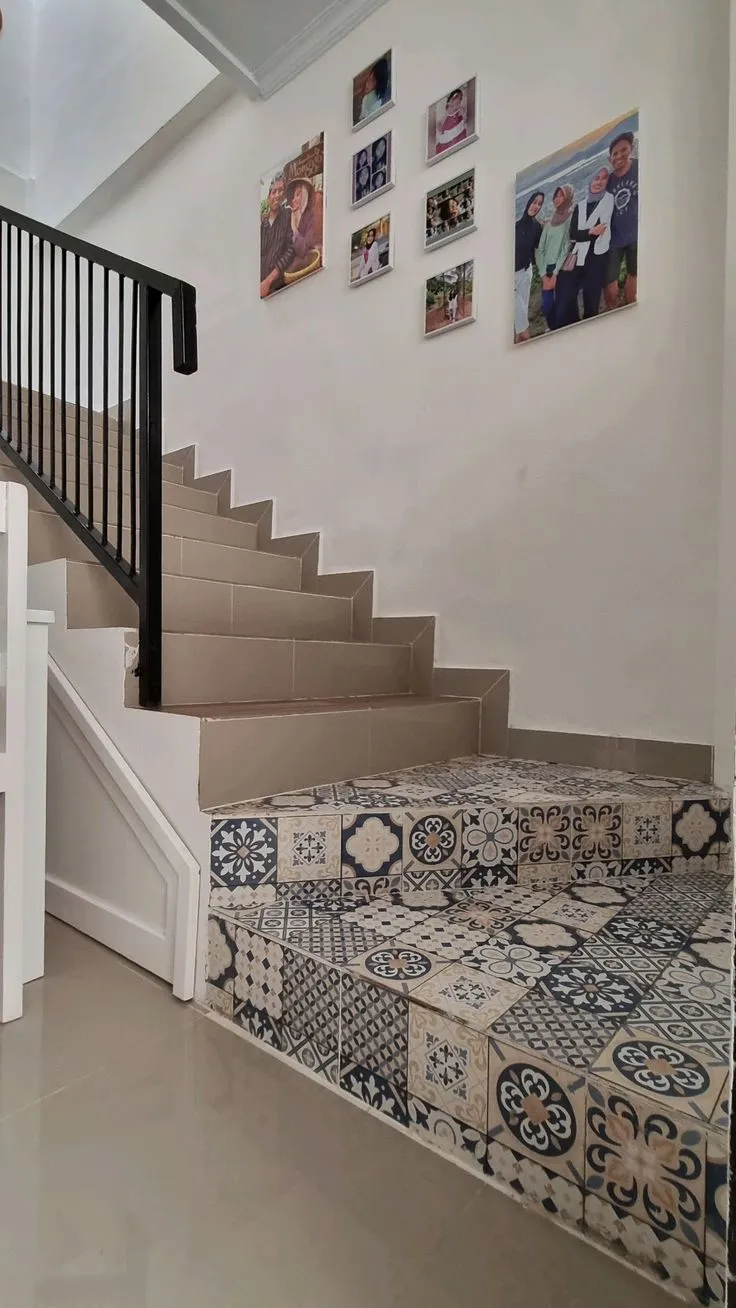
The intricate dance between floor and wall tiles is a fundamental aspect of interior design, dictating a room’s aesthetic appeal, perceived spaciousness, and overall ambiance. At its core, the principle for successful tile combination hinges on establishing a clear focal point: allowing one surface to command attention while the other provides a supportive, complementary backdrop. If a wall boasts an elaborate pattern or vibrant motif, the floor should ideally remain understated, perhaps in a solid, neutral hue. Conversely, when the floor features striking patterned tiles like encaustic or terrazzo, the walls should recede with solid colors or minimalist textures. This deliberate contrast is crucial for preventing visual clutter, which can lead to eye fatigue and make a space feel cramped and overwhelming. Beyond aesthetics, practical considerations such as scale, texture, room function, and even the direction of natural light are paramount, influencing not just comfort but also the long-term value and livability of a home. Ignoring these elements in favor of fleeting trends or promotional discounts can result in a disjointed interior that fails to meet both functional and stylistic expectations.
I. Laying the Foundation: The Core Principle of Tile Harmony
The initial step in any successful tiling project is to designate a primary visual anchor. This foundational rule, echoed by leading interior design experts, is critical: never allow both the floor and walls to vie for dominance. When both surfaces compete for attention, the result is inevitably chaotic and unharmonious. A well-designed space guides the eye, allowing it to rest and appreciate carefully chosen details without feeling overwhelmed.
-
Visual Hierarchy: The 60-30-10 Rule in Tile Design
This classic interior design principle, often applied to color palettes, can be effectively adapted for tile selection. Allocate approximately 60% of the visual space (often the dominant plain surfaces) to a primary, often neutral, tile choice. The secondary tile, perhaps with a subtle pattern or texture, would occupy 30% (e.g., a feature wall or a complementary floor). The remaining 10% can be reserved for a bold accent tile or a highly decorative pattern, strategically placed to draw the eye without overwhelming the larger scheme. For instance, if you choose highly patterned Moroccan tiles for a kitchen backsplash (10% accent), the remaining walls might be a simple subway tile (30% secondary), and the floor a large-format, neutral porcelain (60% dominant). -
The Psychology of Pattern and Color
Patterns and colors profoundly impact our perception of space. Bold, large-scale patterns can make a room feel smaller and more intimate, while small, intricate patterns can add depth without being overbearing. Light, cool colors tend to expand a space, while dark, warm colors create a sense of coziness. Understanding these psychological effects is key to manipulating the visual dimensions of a room through tile choices. For instance, in a compact bathroom, opting for large, light-colored tiles with minimal grout lines on both floor and walls can visually enlarge the space.
II. Decoding Textures and Finishes: A Tactile Approach
Beyond pattern and color, the texture and finish of tiles play a vital role in a room’s sensory experience. A tile’s surface can reflect light, create tactile interest, and influence maintenance requirements.
-
Balancing Sheen and Depth
A common pitfall is combining too many highly textured or glossy surfaces, leading to an overstimulating environment. If your walls feature dimensional (3D) tiles or a highly polished, glossy finish, opt for a matte or honed finish on the floor. This creates a balanced interplay of light and shadow. Matte finishes absorb light, providing a grounded, sophisticated look, while glossy tiles reflect light, adding sparkle and making a space feel brighter. An overly glossy room, particularly in areas with direct sunlight, can lead to uncomfortable glare. -
Functional Considerations of Texture
Texture is not merely aesthetic; it’s functional. Rough, abrasive textures (e.g., rustic, anti-slip tiles) are ideal for floors, especially in wet areas like bathrooms or outdoor spaces, where slip resistance is paramount. However, these textures are ill-suited for kitchen backsplashes or bathroom walls where grease, soap scum, and dust can accumulate in crevices, making cleaning difficult. Smooth, easy-to-wipe surfaces are preferable for high-maintenance wall areas.
III. The Strategic Trade-Off: Where to Emphasize, Where to Subdue

"Subduing" one area does not equate to making it unattractive; rather, it means allowing it to support and elevate the chosen focal point. This strategic allocation of detail ensures a harmonious overall design.
-
Enhancing Architectural Features
If a living room boasts a grand marble TV panel or a commanding stone fireplace, these architectural elements are inherently focal points. In such cases, the floor should defer, perhaps with large-format, plain granite tiles. Such a floor will reflect light, subtly enhancing the wall feature without competing for visual dominance. The seamless, expansive look of large tiles also contributes to an impression of luxury and space. -
Highlighting Premium Materials
Conversely, if you’ve invested in exquisite, handcrafted vintage encaustic tiles for the floor, let them shine. The walls can be kept simple with a sophisticated matte paint finish or classic white subway tiles. This allows the intricate patterns and rich colors of the floor to be the star of the show, conveying a sense of heritage and bespoke craftsmanship. This approach emphasizes that value in design comes from thoughtful placement, not necessarily from an abundance of expensive materials everywhere.
IV. Crafting a Cohesive Narrative: Visual Language Across Spaces
A successful interior design scheme feels unified, not like a random collection of showroom displays. Establishing a "visual language" through consistent elements creates a sense of flow and sophistication.
-
The Power of Unified Color Palettes
The simplest way to achieve cohesion is by employing a monochromatic or analogous color scheme, using varying shades and tones. For example, a dark grey floor paired with lighter grey wall tiles of a smaller size creates an elegant transition and minimizes the risk of clashing colors. This approach is safe yet sophisticated, ensuring visual continuity. -
Geometric Continuity: Shapes and Sizes
Repeating shapes throughout a space can also create a strong visual connection. Pairing 30×30 cm hexagonal floor tiles with smaller 10×10 cm hexagonal wall tiles, for instance, provides a subtle yet powerful design link. The human brain naturally perceives such repetition as orderly and deliberate, contributing to a sense of calm and balance. -
Limiting Design ‘Clash’
As a general rule, limit the combination of distinct tile styles to a maximum of two complementary aesthetics within a single line of sight. Attempting to blend vintage encaustic, classic marble, and rustic wood-look tiles in one area will invariably lead to visual discord and an uncomfortable environment. The goal is synergy, not cacophony.
V. Room-by-Room Mastery: Tailoring Tile Choices to Function and Aesthetic
The specific demands and desired mood of each room should guide tile selection, ensuring both functionality and aesthetic coherence.
-
Living & Family Rooms: Grandeur and Tranquility
These communal areas benefit from an expansive and refined look. Opt for large-format floor tiles, at least 60×60 cm, to minimize grout lines and enhance the perception of space. Given that floors here are often partially covered by rugs and furniture, choose subtle patterns, such as marble with delicate veining. If a pattern is desired, concentrate it on a single accent wall, keeping other walls neutral to maintain balance.
-
Kitchen & Dining Areas: Practicality Meets Style
Kitchens are inherently busy spaces, often filled with cabinetry and appliances. The backsplash area offers an excellent opportunity for creative expression with patterned tiles, such as subway tiles arranged in a herringbone pattern. For flooring, anti-slip properties are paramount. Matte, concrete-look grey tiles are excellent at camouflaging spills and splashes. Crucially, avoid rough-textured tiles on kitchen walls, as their crevices can trap grease and grime, making cleaning a significant challenge. -
Bathrooms: A Canvas for Creative Expression
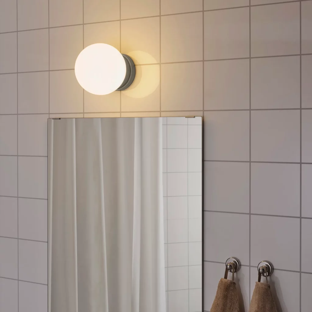
Bathrooms, often smaller and separate from main living zones, are ideal spaces for bolder design experiments. You can confidently pair a strongly patterned floor with solid-colored walls. A popular and safe trick is to divide the wall horizontally: install patterned tiles on the lower half of the wall, and paint the upper section a solid, complementary color. This prevents the room from feeling claustrophobic. Floor tiles in bathrooms must have a rough texture for slip resistance, while wall tiles can be glossy to reflect light and enhance brightness. -
Bedrooms: Serenity and Warmth
Bedrooms are sanctuaries, demanding a serene atmosphere. Avoid high-contrast colors or textures. Wood-look ceramic tiles on the floor can provide warmth and comfort. Pair them with earthy wall tones such like cream, beige, or sage green. It’s generally advisable against tiling bedroom walls fully to the ceiling, as this can create a cold, sterile, "hospital corridor" feel. Partial tiling or paint is usually preferred for a softer look. -
Terraces & Outdoor Spaces: Durability Under the Elements
Outdoor tiles must withstand extreme weather conditions, including heat and heavy rain. Rough-textured tiles resembling natural stone like andesite or pebble wash are logical, durable choices. Combine dark andesite floor tiles with pillars clad in lighter, textured stone-look tiles such as Palimanan. For outdoor terraces, slightly smaller floor tiles are often advantageous, as the increased number of grout lines aids water drainage and enhances slip resistance.
VI. Navigating Trends and Innovations in Tile Design
The tile industry is dynamic, constantly evolving with new styles, materials, and manufacturing techniques. Staying abreast of these trends can inspire contemporary and enduring designs.
-
The Resurgence of Medium-Format Tiles
Recent trends indicate a strong preference for medium-sized tiles, typically ranging from 20×20 cm to 40×40 cm. Their versatility makes them adaptable to various styles, avoiding the overly traditional look of very small tiles or the challenging installation of excessively large formats. -
Terrazzo: A Timeless Comeback
Terrazzo, with its composite chips of marble, quartz, granite, or glass, is experiencing a significant revival. For a chic, coordinated look, install colorful terrazzo floor tiles and then select one dominant color from the terrazzo aggregate to use for the solid-colored wall tiles. -
Japandi and Scandinavian Influences
For adherents of Japandi or Scandinavian aesthetics, a medium-contrast palette is ideal. Consider terracotta floors paired with warm cream walls to create a cozy and inviting atmosphere that embodies the minimalist yet warm principles of these styles. -
Technological Advancements: Digital Printing and Rectified Edges
Modern tile manufacturing benefits from digital printing technology, allowing for incredibly realistic reproductions of natural materials like wood, stone, and marble, complete with subtle variations. Rectified edges, precisely cut for minimal grout lines, are also gaining popularity, offering a seamless, sophisticated look that mimics continuous surfaces.
VII. Avoiding Common Pitfalls: Ensuring Visual Success

Even with the best intentions, certain design choices can sabotage a room’s aesthetic. Awareness of these common errors is key to achieving a harmonious result.
-
Pattern Overload and Scale Mismatch
A cardinal sin in tile design is combining two busy patterns of identical scale in a confined space. Large floral patterns on the floor clashing with intricate geometric designs on the walls will inevitably create visual chaos and lead to discomfort. The eye needs "breathing room" to appreciate individual elements. -
The Peril of Clashing Color Temperatures
Color temperature is crucial for cohesion. Pairing cool-toned white-blue marble with warm, yellowish-cream walls creates a jarring effect, making the tiles appear mismatched or even dated. Ensure that all chosen colors share a consistent underlying temperature (warm, cool, or neutral) to achieve a harmonious blend. -
Grout Line Disorientation
The orientation of grout lines can significantly impact visual flow. Installing rectangular floor tiles lengthwise and then wall tiles crosswise without a clear design rationale creates a confusing, disoriented look. Deliberate alignment or contrasting patterns with clear transitions are essential. -
Inconsistent Wall Tile Heights
Tiling only part of a wall, to an awkward height (e.g., mid-chest level), often disrupts the room’s proportions and appears unfinished. It’s generally more aesthetically pleasing to either tile fully to the ceiling or to a well-defined architectural height, such as a wainscoting line (approximately one-third of the wall height).
VIII. Technical Precision: Dimensions, Grout, and Proportion
Beyond aesthetics, technical aspects of tile selection and installation are vital for both appearance and longevity.
-
The Illusion of Space: Tile Size and Perception
The size of floor tiles directly influences the perceived spaciousness of a room. Larger tiles result in fewer grout lines, creating a more expansive and uninterrupted surface that makes a room feel larger and more open. This is why large-format tiles are favored for contemporary, minimalist designs. -
The Role of Grout: Aesthetic and Functional
Grout is not just a filler; it’s a design element. For a seamless, monolithic look, choose grout that matches the tile color precisely. If the intention is to highlight the tile’s shape or pattern, a contrasting grout color can be used to emphasize the grid or individual tile units. Beyond aesthetics, grout protects tile edges and prevents moisture penetration. -
Proportional Harmony: Wall vs. Floor Tile Sizes
A general rule of thumb for visual balance is that wall tile size should be equal to or smaller than floor tile size. Installing exceptionally large tiles (e.g., 60×120 cm) on a wall when the floor only has 40×40 cm tiles can create a top-heavy, visually unstable effect. Logically, the floor should appear more solid and substantial to support the room’s structure.
IX. Material Durability and Environmental Considerations

Selecting the right tile material for its intended application is critical for durability, maintenance, and long-term satisfaction.
-
Matching Material to Traffic and Exposure
Different tile types possess varying levels of density and resistance. Graniteware or homogeneous tiles, known for their high density and scratch resistance, are indispensable for high-traffic areas like living room floors. In contrast, walls do not bear foot traffic, making more affordable ceramic (red body) tiles a perfectly safe and economical choice. This strategic allocation allows for budget optimization, directing resources towards higher-grade materials where functional demands are greatest. -
The Impact of Natural Light
The interaction of tiles with natural light is a significant design factor. Installing highly glossy tiles in a room with direct afternoon sun exposure can lead to uncomfortable glare and even contribute to an increase in room temperature due to light reflection. Matte or honed finishes are often preferable in such conditions to diffuse light more gently. -
Sustainable Sourcing and Eco-Friendly Options
The modern homeowner is increasingly conscious of environmental impact. Consider tiles made from recycled content or those produced using sustainable manufacturing processes. Many manufacturers now offer certifications for their eco-friendly products, allowing consumers to make responsible choices that benefit both their home and the planet.
X. Seamless Transitions: Finishing Touches and Accents
The juncture where floor meets wall, or where one tile type transitions to another, requires thoughtful treatment to ensure a polished, professional finish.
-
Skirting and Baseboards: Bridging the Gap
Installing skirting (baseboards) at the base of walls serves multiple purposes: it softens the abrupt angle between floor and wall, protects the lower wall from scuffs and cleaning tools, and provides a finished look. Skirting in a color that matches the floor can visually extend the floor space, making the room appear wider. -
Decorative Borders and Listellos
When transitioning from a tiled wall section to a painted wall, a "listello" or small decorative border tile provides a clean, elegant demarcation. These accent strips add a touch of refinement and prevent an unfinished appearance. -
Protective and Aesthetic Profiles
For external corners of tiled walls, aluminum or stainless steel profiles can be installed. These not only protect the tile edges from chipping upon impact but also introduce a crisp, metallic accent that defines the wall’s geometry, adding a contemporary touch.
XI. Manipulating Space: The Art of Installation Patterns
The way tiles are laid can dramatically alter a room’s perceived dimensions and character, offering a powerful tool for spatial manipulation.

-
Straight Lay: Classic Simplicity
The straight lay pattern, where tiles are installed in a simple grid, is ideal for large-format tiles. This minimalist arrangement highlights the tile’s natural pattern or texture without distracting lines, contributing to a clean, orderly aesthetic. It is particularly effective in modern and contemporary designs. -
Brick Bond: Timeless and Forgiving
Also known as subway pattern, the brick bond involves staggering rectangular tiles, mimicking traditional brickwork. This classic pattern is highly versatile and effective at subtly camouflaging slight imperfections or unevenness in wall surfaces, adding a sense of timeless charm. -
Diagonal Patterns: Expanding Visual Horizons
Laying square tiles diagonally (in a diamond pattern) is an excellent technique for making irregular or narrow rooms appear wider and more expansive. The diagonal lines draw the eye across the space, creating an illusion of greater depth and breaking up monotonous linear perspectives. -
Beyond the Basics: Herringbone, Basketweave, and More
Beyond these fundamental patterns, more intricate layouts like herringbone (a zigzag pattern), basketweave (tiles arranged to resemble woven fabric), or pinwheel (a small central tile surrounded by four larger ones) can introduce significant visual interest and texture. These are often best reserved for accent areas or smaller rooms where their complexity won’t overwhelm.
XII. Expert Q&A: Addressing Key Concerns
-
Floor Color: Darker or Lighter?
There is no strict rule that the floor must always be darker than the walls. While a darker floor can create a sense of grounding and stability, a light, bright floor combined with darker walls is a valid design choice, particularly for maximizing light reflection in specific areas or creating a dramatic contrast. The key is balance and intent. -
Using Floor Tiles on Walls
It is perfectly acceptable, and often desirable, to use floor tiles on walls, especially large-format porcelain or stone-look tiles, as this minimizes grout lines and creates a luxurious, seamless effect. However, it is critically important never to use wall-specific tiles on the floor. Wall tiles are typically thinner, less dense, and lack the required durability and slip resistance for foot traffic, making them prone to breakage and hazards. -
Color Palettes: Limiting the Palette for Harmony
To maintain visual harmony and avoid a cluttered appearance, most interior designers recommend limiting the primary color palette in a single room to three main colors. This can be broken down using the 60-30-10 rule: 60% dominant color (often neutral), 30% secondary color, and 10% accent color. Exceeding this often leads to visual overload. -
Seamless Room Transitions
When transitioning between different floor tile types or patterns in adjacent rooms, install a threshold or transition strip directly beneath the closed door. This can be a strip of granite, wood trim, or a metallic profile (e.g., brass or aluminum). This element provides a clean visual break, allowing each room’s flooring to stand independently while creating a polished transition as one moves from one space to another.
In conclusion, the thoughtful selection and combination of floor and wall tiles are cornerstones of effective interior design, transforming mere surfaces into integral components of a home’s character. By adhering to principles of visual hierarchy, balancing textures, considering room function, and embracing both established and emerging trends with an informed perspective, homeowners and designers can craft spaces that are not only aesthetically pleasing but also profoundly comfortable, functional, and enduring. This meticulous approach ensures that every tiled surface contributes to a cohesive and inviting narrative, elevating the everyday experience of living within these carefully designed environments.