 Lusiana Hamidun
Monologue fans of the 2006 film The Devil Wears Prada will recall Miranda Priestly’s scathing critique of Andy Sachs’ sweater, famously noting that the garment was not merely blue, but cerulean. This cinematic moment serves as a poignant reminder that in the world of design, aesthetics, and fashion, color taxonomy is far more granular than the naked eye might initially perceive. Among the most frequently confused palettes are ivory and beige, two foundational neutral tones that often dictate the success of a sartorial choice, an interior design project, or a professional branding strategy. While both occupy the "neutral" spectrum, they possess distinct chemical and visual compositions that require a trained eye to distinguish.
The Historical and Visual Distinction Between Ivory and Beige
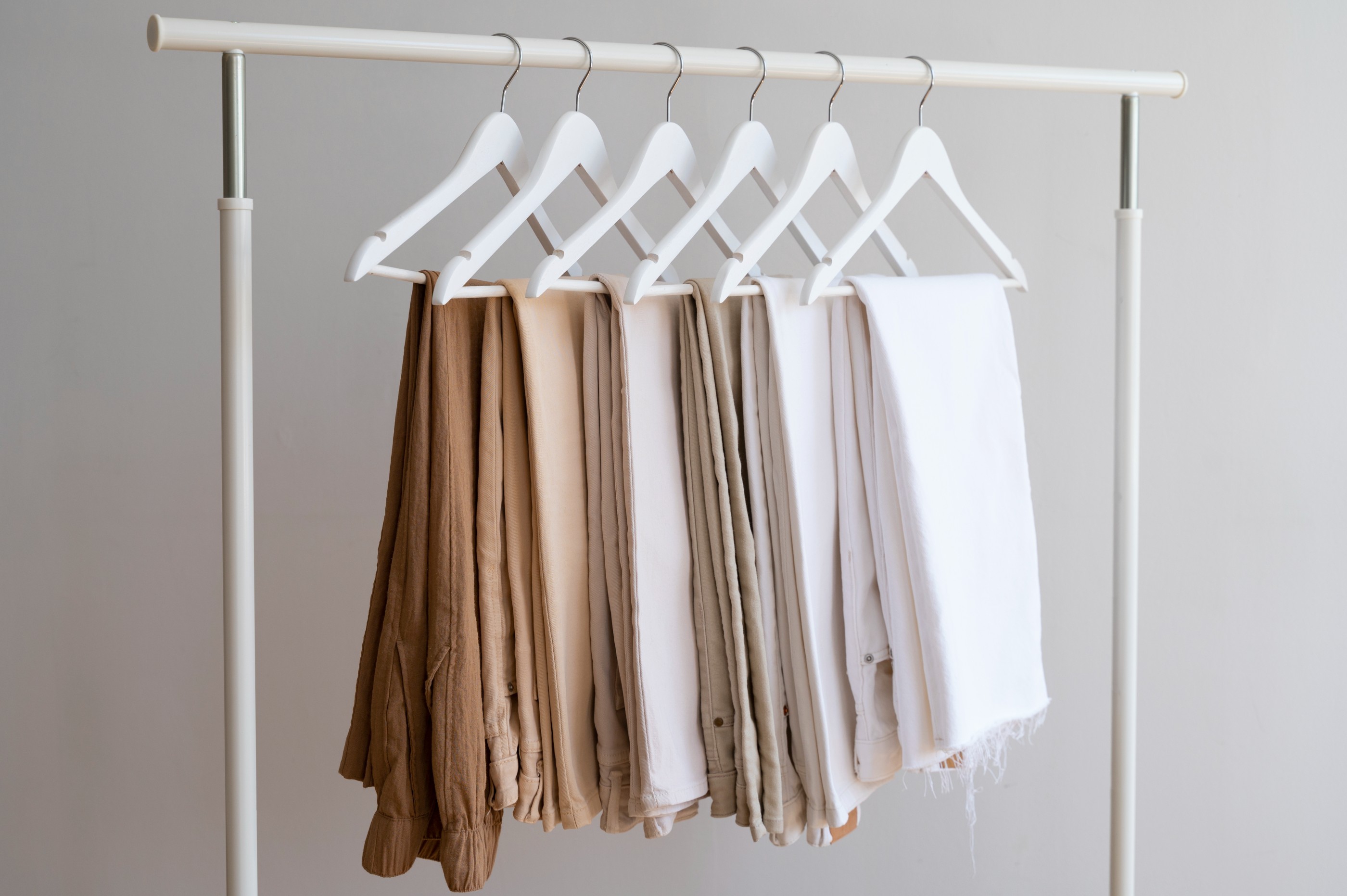
To understand the difference, one must look at the color theory behind these shades. Ivory, historically named after the material derived from elephant tusks, is essentially an off-white color with a very subtle, warm undertone of yellow. It sits precisely between pure, clinical white and the more saturated cream. In the history of textiles, ivory has long been associated with luxury and sophistication, often used in wedding couture and high-end upholstery to signify a softer, more organic alternative to stark, bleached white.
Beige, by contrast, is a complex neutral. It is defined as a pale, sandy fawn color. Unlike ivory, which leans toward the yellow-white spectrum, beige is a tripartite blend of white, light brown, and a distinct hint of grey. This grey element is what provides beige with its "earthy" characteristic. Because beige is derived from a mix of brown and grey, it exists on a much wider spectrum than ivory. It can shift from "cool beige," which leans toward taupe and grey, to "warm beige," which leans toward tan or light caramel.
Technical Data and Color Composition
In digital design, these differences are codified. In the sRGB color model, ivory is typically represented as #FFFFF0, maintaining high luminosity and minimal saturation. Beige, in standard web color representation, is often closer to #F5F5DC, which carries a higher concentration of red and green channels to simulate that sandy, brownish warmth.
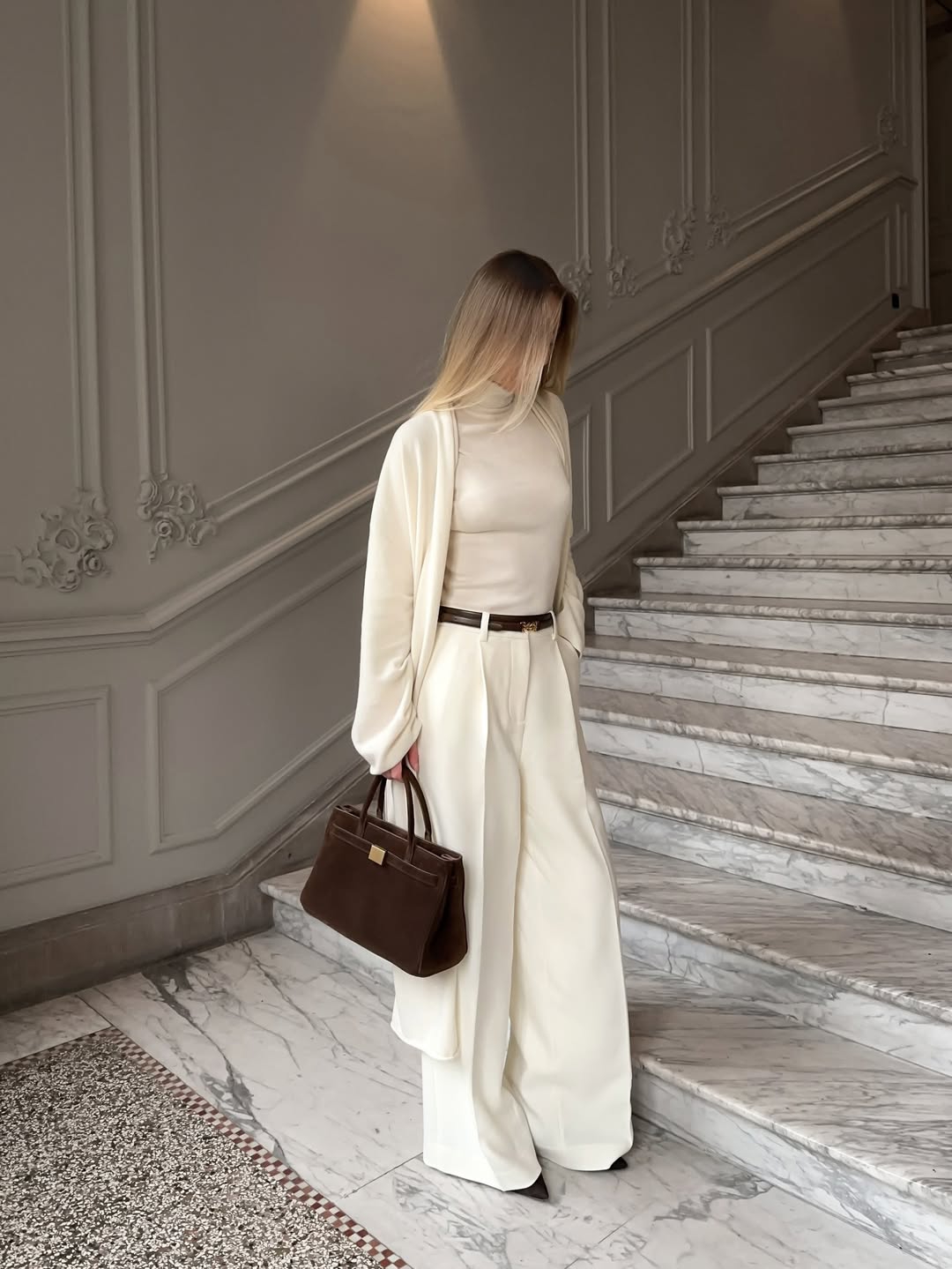
The psychological impact of these colors is also well-documented in interior design literature. Ivory is frequently utilized to expand a space, providing a clean, airy, and luminous quality that reflects light similarly to white but with a "softer" edge that feels more inviting. Beige, conversely, is utilized to ground a space. It provides a sense of stability and warmth, making it a staple in minimalist and Scandinavian interior styles where the goal is to create a serene, grounded environment.
Navigating Undertones in Fashion
The debate regarding ivory versus beige often culminates in the fashion industry, specifically regarding how these colors interact with human skin undertones. The fashion industry categorizes skin undertones into three primary groups: cool, warm, and neutral.
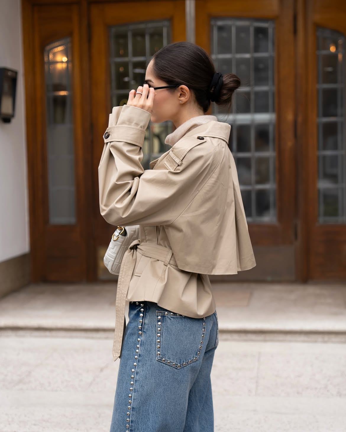
For individuals with cool undertones, the yellow-heavy, warmer profile of ivory can sometimes clash, creating an appearance of fatigue or dullness. These individuals are often better served by "cool" beige shades that possess a greyish or taupe cast. Conversely, individuals with warm or golden undertones often find that ivory enhances their natural glow, providing a vibrant contrast that feels luxurious.
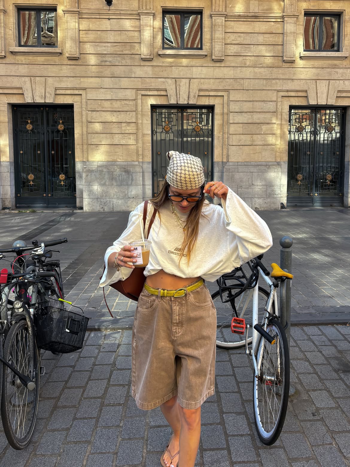
Data from color analysis experts suggests that the "wrong" neutral can wash out up to 30% of a person’s facial vibrancy. This is why high-end retail brands now frequently provide specific color descriptions that differentiate between "warm cream," "cool ivory," and "sand beige." By aligning one’s wardrobe with these specific undertones, a person can effectively maximize the "lit-from-within" effect, a concept long practiced by celebrity stylists to ensure their clients look their best under both natural and artificial studio lighting.
Impact on Consumer Behavior and Digital Retail
The confusion between these shades has significant implications for the e-commerce sector. According to a 2023 retail report, returns in the fashion category are frequently linked to "color inaccuracy," with a high percentage of these returns occurring in the neutral category. When a consumer purchases an "ivory" blouse online, they are expecting the soft, yellow-tinted white. If the product arrives as a sandy, brownish beige, the discrepancy creates a negative consumer experience.

This has forced digital retailers to adopt more sophisticated product photography standards. Major platforms now mandate that images of neutral-toned clothing be taken against a controlled, neutral-grey background with standardized 5500K color-temperature lighting. This prevents the "screen-bias" phenomenon, where a user’s mobile display settings—such as "True Tone" or "Night Shift"—artificially warm the colors on the screen, causing a product to appear more yellow or orange than it is in reality.
Strategic Styling: Beyond the Basics
The versatility of ivory and beige allows for an expansive range of styling options, provided one understands the balance of contrast.
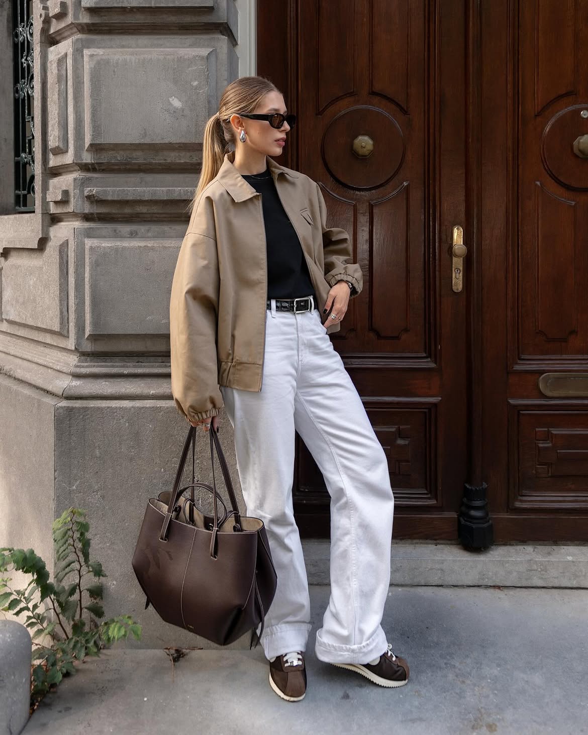
- The Minimalist Palette: Combining beige with black and white is a masterclass in balance. The black provides the necessary visual anchor, while the white creates a focal point, and the beige acts as the bridge that softens the harshness of the high-contrast pair.
- The Monochromatic Depth: Pairing ivory with various shades of brown, specifically espresso or dark chocolate, creates a "quiet luxury" aesthetic. The key here is the intensity of the brown, which highlights the brightness of the ivory.
- The Professional Contrast: Pairing ivory with charcoal or slate grey is a sophisticated alternative to the standard white-and-black corporate attire. The yellow-based ivory provides a warmer, more approachable look than the coldness of a crisp, white shirt.
- The Unexpected Pop: Combining beige with bold, saturated colors like crimson or emerald green has become a hallmark of modern street style. Because beige is muted, it serves as a "quiet" background that allows the secondary, bold color to shine without being overwhelming.
Practical Tips for Online Shopping
To mitigate the risk of color mismatch during online transactions, consumers are advised to adopt a three-step validation process:
- Calibration: Disable "Blue Light Filter" or "Night Shift" modes on devices when evaluating garment colors. These features are designed to reduce eye strain by adding an amber tint to the screen, which fundamentally alters the perception of neutral colors.
- Contextual Comparison: Look for product photos that include an object of known color, such as a white paper or a dark-colored accessory. Comparing the item against a standard, non-digital reference point can reveal the true temperature of the color.
- Review Analysis: Examine user-generated content (UGC). Photos uploaded by real customers—typically taken in natural, ambient light—provide a more accurate representation of how the fabric reacts in real-world settings, as opposed to professionally edited, heavily stylized catalog photography.
Conclusion
The distinction between ivory and beige is not merely a matter of semantics; it is a fundamental aspect of color literacy that influences aesthetics, psychology, and consumer satisfaction. Whether one is selecting a foundation shade for makeup, designing a living space, or curating a capsule wardrobe, recognizing the subtle interplay of yellow, brown, and grey undertones is essential. As the fashion industry continues to shift toward more sustainable and timeless palettes, the ability to discern these subtle nuances will remain a valuable skill for any style-conscious individual. By applying a methodical approach to color identification—understanding the undertones, the lighting conditions, and the intended visual impact—one can navigate the vast world of neutrals with confidence and precision.