The fundamental principle guiding the selection and combination of floor and wall tiles dictates a singular focus: designate one area as the primary visual draw, allowing the other to serve as a complementary backdrop. If a wall features an intricate pattern or vibrant motif, the flooring should ideally remain understated, neutral, and devoid of busy designs. Conversely, if the intention is to highlight an exquisite patterned floor, such as vintage encaustic tiles or a sophisticated terrazzo, the walls should adopt a solid color palette without competing patterns. This approach is not merely an aesthetic preference; it is a critical strategy to prevent visual dissonance that can induce eye fatigue and make a space feel confined and overwhelming. Understanding the interplay of scale, texture, and material properties is paramount, extending beyond initial allure or promotional discounts to encompass the room’s function, natural light conditions, and long-term comfort.
The Art and Science of Tile Harmony: Elevating Interior Spaces
The strategic application of tiles on floors and walls has evolved significantly, transforming from purely functional coverings into integral elements of architectural expression and interior design. Historically, tiles were prized for their durability, hygiene, and resistance to moisture, making them staples in kitchens, bathrooms, and high-traffic areas. Today, advancements in manufacturing and design have broadened their appeal, offering an unparalleled range of materials, patterns, textures, and sizes that cater to every aesthetic inclination, from minimalist modern to opulent classical. The selection process, therefore, is no longer a simple matter of choosing a color or material; it involves a nuanced understanding of how these surfaces interact to define a space’s character, mood, and perceived dimensions. According to leading interior architect Dr. Anya Sharma, "Tiles are not just coverings; they are the canvas upon which the story of a space is told. Their judicious combination is key to creating environments that are both beautiful and profoundly livable." This holistic perspective emphasizes that thoughtful tile choices contribute significantly to a property’s ambiance, functionality, and even its market value.
Beyond Aesthetics: The Functional Imperatives of Tile Selection
While visual appeal is often the primary driver, the functional aspects of tile selection are equally critical. Each space within a home or commercial establishment presents unique demands on its surfaces. For instance, kitchens and bathrooms require tiles with low water absorption rates and good slip resistance, often indicated by specific PEI (Porcelain Enamel Institute) ratings for abrasion resistance and DCOF (Dynamic Coefficient of Friction) values for wet conditions. High-traffic areas like living rooms and hallways benefit from durable, scratch-resistant materials such as porcelain or natural stone. The orientation of the room and the amount of natural light it receives also play a crucial role. Highly glossy tiles in a south-facing room can create excessive glare and contribute to heat gain, whereas matte finishes can absorb light, potentially making a dimly lit room feel darker. "A tile’s beauty should never compromise its utility," advises construction materials specialist Mark Jansen. "Considering the daily wear and tear, maintenance requirements, and environmental factors is an investment in the longevity and comfort of the space."
Establishing Visual Hierarchy: The Golden Rule of Focal Points
The cornerstone of successful tile combination lies in the deliberate establishment of a visual hierarchy. The eyes naturally seek a focal point, and when both floor and wall surfaces clamor for attention, the result is often chaotic and disorienting. The "one star" principle dictates that if the floor is to be the star, perhaps with an intricate geometric pattern, a bold color, or a luxurious material like polished marble, the walls should recede into the background with a plain, neutral paint or simple, solid-colored tiles. Conversely, a dramatic feature wall—perhaps adorned with Moroccan-inspired mosaics, a textured 3D tile, or a striking graphic pattern—demands a subdued floor, such as a plain concrete-look tile or a classic solid-colored ceramic.
This strategic interplay ensures that the chosen focal point can be fully appreciated without overwhelming the senses. A study by the American Society of Interior Designers (ASID) on spatial perception highlighted that well-defined visual hierarchies reduce cognitive load, making spaces feel more ordered and serene. The only notable exception to this rule typically applies to exceptionally large spaces, where the sheer volume allows for a more daring interplay of patterns. Even then, the success hinges on a significant difference in scale: a large-scale, bold pattern on the floor might be paired with a very small, intricate pattern on the wall, creating a dynamic contrast rather than a collision.
The Dynamic Duo: Patterns, Textures, and Scale
The selection of patterns and textures requires careful deliberation. When opting for a patterned floor, such as a traditional encaustic cement tile or a vibrant geometric design, the walls should be kept simple, perhaps with a clean white paint or a large-format plain ceramic tile. This allows the intricate details of the floor to stand out without visual competition. Conversely, if a patterned wall is desired—think of a mosaic backsplash in a kitchen or an accent wall in a bathroom with decorative tiles—the floor should be muted, perhaps in a solid grey, beige, or off-white.
Texture adds another layer of complexity and interest. Combining a highly textured, rustic floor (e.g., slate or rough-hewn ceramic) with a raised, 3D wall tile can create an overly busy and even uncomfortable sensory experience. A balanced approach would involve pairing a textured floor with a smooth wall, or a textured wall with a sleek, flat floor. Similarly, the reflectivity of tiles plays a role. A glossy wall tile, which reflects light and can expand the perceived size of a room, might be best complemented by a matte floor tile. This contrast helps balance the light reflections in the space, preventing glare and creating a more harmonious environment.

Crafting Cohesion: Unifying Elements for a Seamless Look
Beyond the "one star" rule, achieving a cohesive look requires establishing a visual thread that ties the entire room together. This can be accomplished through consistent color palettes, repeating shapes, or adhering to a particular design style.
One of the simplest and most effective methods is to utilize analogous colors or varying shades of the same color. For instance, a dark grey floor tile paired with a lighter grey wall tile of a smaller size creates an elegant transition that is inherently safe and sophisticated. This gradient effect guides the eye smoothly across surfaces.
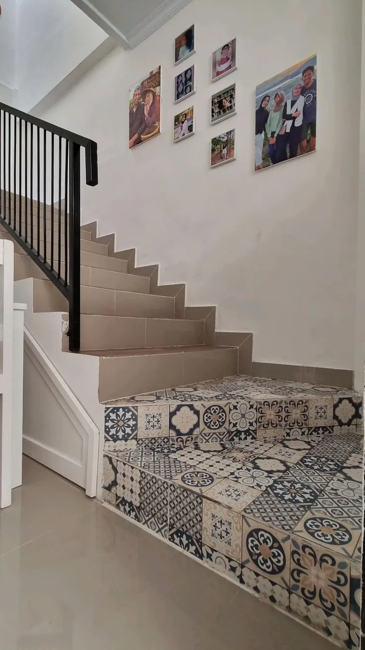
Another powerful technique involves repeating shapes across different scales. Imagine a hexagonal floor tile measuring 30×30 cm beautifully complemented by smaller 10×10 cm hexagonal tiles on an accent wall. The human brain naturally recognizes and appreciates this repetition, interpreting it as a deliberate and organized design choice.
However, restraint is key when it comes to style. An interior space should not resemble a tile showroom. Limiting the combination to a maximum of two complementary styles ensures visual harmony. Attempting to blend disparate styles—such as vintage encaustic tiles, classic marble, and rustic wood-look ceramics within a single sightline—will inevitably lead to a jarring and aesthetically confusing environment. "Successful design is often about what you leave out, not what you put in," notes interior design veteran Emily Davies. "A curated selection of materials, even when varied, must tell a unified story."
Mastering Room-Specific Tile Strategies
The unique demands and characteristics of each room necessitate tailored tile selection strategies.
Living & Family Rooms
These communal areas demand a sense of spaciousness and refined order. Large-format floor tiles, ideally at least 60×60 cm, are recommended to minimize grout lines and create an expansive feel. Floors here are often partially covered by rugs and substantial furniture, so overly busy patterns should be avoided. Subtle marble veins or a refined wood-look porcelain can impart elegance without distraction. If a pattern is desired, it should be confined to a single accent wall, allowing the remaining walls to maintain a neutral backdrop. The goal is to create an inviting and elegant space that fosters relaxation and conversation.
Kitchen & Dining
Kitchens are highly functional spaces, typically dense with cabinetry, appliances, and work surfaces. The backsplash area above countertops presents an ideal opportunity for creative expression with patterned tiles, such as classic subway tiles arranged in a herringbone or basketweave pattern. For flooring, anti-slip properties are paramount. A matte, concrete-grey or dark-toned porcelain tile not only offers excellent grip but also expertly conceals spills and everyday grime. It is crucial to avoid highly textured or rough-surfaced tiles on kitchen walls, as their crevices can trap grease and dust, making cleaning a challenging and arduous task. Smooth, easily wiped surfaces are essential for maintaining hygiene.
Bathrooms
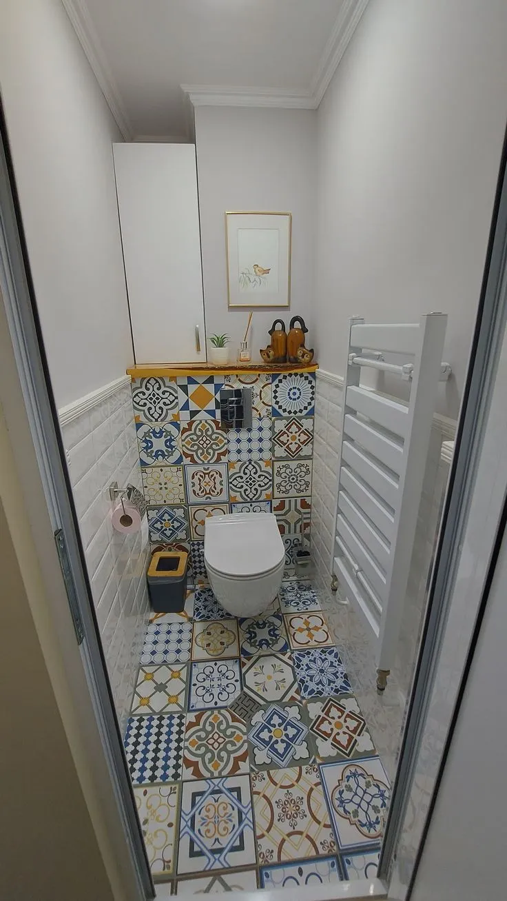
Often the smallest rooms, bathrooms offer a unique canvas for bolder design experimentation, largely due to their enclosed nature and separation from the main living zones. Here, a strong patterned floor can be effectively combined with solid-colored walls. A clever design trick is to divide the wall horizontally: a patterned tile on the lower half (wainscoting style) with a plain painted or solid-colored tiled upper section prevents the space from feeling overwhelmed or "choking." Bathroom floors must feature a coarse or anti-slip texture for safety, while walls can embrace glossy finishes to reflect light and enhance the sense of spaciousness.

Bedrooms
As sanctuaries for rest and rejuvenation, bedrooms demand a serene and calming atmosphere. Contrasting colors or jarring textures should be avoided. Wood-look ceramic or porcelain tiles on the floor can introduce warmth and natural appeal, perfectly complemented by walls in soothing earth tones such as cream, beige, or sage green. It is generally advisable to avoid tiling bedroom walls fully from floor to ceiling, as this can create a cold, sterile, or institutional feel reminiscent of a hospital corridor. Partial tiling or accent walls are preferable if tiles are desired.
Terraces & Outdoor Areas
Outdoor tiles must withstand harsh environmental conditions, including intense sunlight, heavy rain, and temperature fluctuations. Durable, non-slip, and weather-resistant materials are crucial. Tiles with a rough texture, such as natural stone (e.g., andesite, pebble stone) or textured porcelain, are logical choices for flooring. A combination of dark andesite floor tiles with lighter palimanan stone-clad pillars can create a visually appealing contrast. For outdoor terraces, slightly smaller floor tiles are often preferred, as the increased number of grout lines aids in water drainage and provides better traction, enhancing safety during wet conditions.
Navigating Contemporary Tile Trends and Innovations
The tile industry is dynamic, constantly introducing new materials, finishes, and design sensibilities. Recent trends show a strong inclination towards medium-sized tiles, typically ranging from 20×20 cm to 40×40 cm. This versatile size strikes a balance between traditional small formats and contemporary large formats, offering ease of installation without appearing overly dated.
The resurgence of terrazzo is a significant trend, bringing a playful yet sophisticated aesthetic to modern interiors. For those embracing this, consider a vibrant, multi-colored terrazzo floor. To maintain harmony, select one dominant color from the terrazzo aggregate and apply it as a solid color for the wall tiles or paint. This subtly links the two surfaces.
For devotees of Japandi or Scandinavian design philosophies, which prioritize simplicity, functionality, and natural elements, a medium-contrast palette is ideal. Pairing a warm terracotta floor with soft, creamy beige walls, for instance, evokes a profound sense of comfort and homeliness. Beyond aesthetics, the industry is also seeing a rise in sustainable tile options, including recycled glass tiles, porcelain made from industrial waste, and responsibly sourced natural stones, reflecting a growing consumer demand for eco-conscious building materials.
Common Pitfalls and How to Avoid Them
Even with the best intentions, certain tile combinations can lead to visually disastrous results. Understanding these common mistakes is crucial for achieving a refined aesthetic.
One of the most egregious errors is combining two busy patterns of identical or similar scale in a confined space. A floor adorned with large floral motifs paired with a wall featuring intricate geometric patterns will invariably lead to visual chaos and a sense of unease. The human eye struggles to find a resting point, resulting in a dizzying effect.
Another common oversight involves clashing color temperatures. Pairing a cool-toned, bluish-white marble with a warm, yellowish-cream wall tile will make the entire scheme feel disjointed and potentially make the marble appear dingy or the cream wall look faded. Maintaining a consistent color temperature—either predominantly warm or cool—across all surfaces is essential for a harmonious look.

Misaligned grout lines can also disrupt visual flow. Installing rectangular floor tiles longitudinally and then abruptly switching to transversely laid wall tiles without a clear design rationale creates a jarring effect. Grout lines, though often overlooked, form an underlying grid that significantly impacts spatial perception. Thoughtful planning of tile orientation ensures a cohesive visual rhythm.
Finally, the awkward placement of half-height wall tiles (often referred to as a "wainscoting" that falls at an arbitrary height) can severely distort a room’s proportions. This often makes walls appear shorter or the room feel off-balance. If full-height tiling is not desired, it is generally better to commit to a classic wainscoting height (typically one-third to half the wall height) or tile a full wall from floor to ceiling to maintain visual integrity.
Precision in Practice: Technical Specifications for Flawless Installation
Beyond aesthetic considerations, technical specifications are paramount for a durable and visually appealing tile installation.
Tile Size and Perception of Space: The size of floor tiles significantly influences how spacious a room feels. Larger format tiles (e.g., 90×90 cm or 120×60 cm) minimize the number of grout lines, creating an uninterrupted, expansive surface that visually enlarges a room. This effect is particularly beneficial in smaller spaces where a cluttered grid of grout lines can make the room feel even more constricted.
Proportionality in Design: A crucial rule of thumb in tile proportion dictates that wall tiles should generally be smaller than or equal in size to floor tiles. This creates a visually stable foundation, reinforcing the perception that the floor is a solid, supportive base for the room. Conversely, installing very large wall tiles (e.g., 60×120 cm) above much smaller floor tiles (e.g., 40×40 cm) can make the room feel top-heavy and visually unbalanced.
The Role of Grout: Grout, often considered a mere filler, plays a pivotal role in the final appearance of a tiled surface. For a seamless, monolithic look where the tiles themselves are the focus, grout color should closely match the tile color. This minimizes the visual interruption of grout lines. However, if the intention is to highlight the pattern, shape, or individual tiles—such as in a geometric pattern or a classic subway tile arrangement—a contrasting grout color can be used to accentuate these design elements.
Grout Width for Different Tile Types: The width of the grout line is determined by the type of tile. Rectified tiles, which are precisely cut with sharp, uniform edges, allow for very thin grout lines (1-2 mm). This creates a near-seamless appearance. Non-rectified tiles, with their slightly rounded or irregular edges, require wider grout lines (3-5 mm) to accommodate minor size variations and ensure proper adhesion. Adhering to manufacturer recommendations for grout width is essential for both aesthetic appeal and long-term durability.
Strategic Material Allocation: Balancing Budget and Performance
The choice of tile material should also be informed by both performance requirements and budget considerations. For high-traffic areas like living rooms, hallways, and commercial spaces, high-density materials like porcelain or homogeneous tiles (often referred to as granite in some regions) are indispensable. These materials boast superior scratch, stain, and abrasion resistance, ensuring longevity and maintaining aesthetic appeal despite heavy use. Their robust nature makes them a sound long-term investment.

Conversely, walls do not bear foot traffic and thus do not require the same level of impact resistance. Standard ceramic tiles (often termed "red body" ceramics), which are typically less dense and more affordable, are perfectly adequate for most wall applications. This strategic allocation allows for significant cost savings on wall tiling, freeing up budget to invest in higher-quality, more durable materials for flooring, where performance is critical.
Furthermore, environmental factors, particularly sunlight exposure, should influence material choice. Installing highly glossy floor tiles in a room with direct, intense afternoon sun can lead to uncomfortable glare and contribute to increased indoor temperatures due to light reflection. In such scenarios, a matte finish or a material with lower reflectivity would be a more practical and comfortable choice.
The Finishing Touch: Seamless Transitions and Protective Accents
The intersection of floor and wall is a critical design juncture that can be enhanced through thoughtful detailing.
Skirting or Plinth: Installing a skirting board (or plinth) at the base of the wall where it meets the floor serves multiple functions. It softens the often-sharp angle between the two surfaces, provides a protective barrier against scuffs from cleaning equipment, and, when matched in color to the floor, can visually extend the floor space, making the room appear larger.
Listello or Border Tiles: Where a tiled wall transitions to a painted surface, a decorative listello or border tile can provide a clean, elegant separation. This accent piece acts as a visual "punctuation mark," offering a neat finish and preventing an abrupt visual break.
Edge Profiles: For external corners of tiled walls, using aluminum or stainless steel profiles is a practical and aesthetically pleasing solution. These profiles protect the tile edges from chipping due to accidental impact and introduce a crisp, modern metallic accent, delineating the wall’s form with precision.
The Psychology of Layout: Manipulating Space with Tile Patterns
The way tiles are laid can dramatically alter the perception of space, making a room feel larger, longer, or wider.
Straight Lay (Grid Pattern): This classic, rectilinear pattern involves laying tiles in a simple grid, with all grout lines running parallel and perpendicular to the walls. It is particularly effective for large-format tiles, as it creates a clean, uncluttered surface that allows the natural beauty or subtle pattern of the tile itself to take center stage. This layout promotes a sense of order and expansiveness.

Brick Bond (Running Bond): Mimicking traditional brickwork, this pattern involves staggering rectangular tiles so that the end of each tile aligns with the center of the tiles above and below it. It is an iconic choice for subway tiles and other rectangular formats. The horizontal lines created by this pattern can visually widen a narrow room. Moreover, its forgiving nature can subtly mask minor irregularities or imperfections in the underlying wall structure.
Diagonal Lay (Diamond Pattern): In this layout, square tiles are installed at a 45-degree angle to the walls, creating a diamond pattern. This technique is remarkably effective in manipulating perceived space. For rooms with irregular shapes, sharp angles, or a narrow configuration, the diagonal lines break the direct visual focus on the room’s boundaries, making it feel more expansive and less constrained. It can also be used to subtly guide the eye towards a focal point or through a transitional area.
Expert Insights: Addressing Common Tile Queries
To further demystify the art of tile combination, here are answers to frequently asked questions, drawing on established design principles and industry knowledge.
Is It Mandatory for Floor Colors to Be Darker Than Walls?
While a traditional design tenet often suggests darker floors to create a sense of grounded stability, it is by no means a strict rule. Contemporary design frequently embraces lighter floors, even stark white, especially when paired with darker walls. This approach can dramatically enhance light reflection, making a room feel brighter and more open. The key is balance and intent; a light floor can be a powerful design statement when executed thoughtfully.
Can Floor Tiles Be Used on Walls?
Yes, in many cases, especially with high-quality porcelain or homogeneous tiles (granite). Using large-format floor tiles on walls can create a luxurious, seamless look with minimal grout lines, often favored in modern minimalist designs. However, the reverse is strictly prohibited: wall-specific tiles are generally thinner, less dense, and lack the structural integrity and abrasion resistance required for flooring. Installing wall tiles on a floor would lead to rapid cracking and damage. Always check the tile’s PEI rating and manufacturer’s specifications.
What is the Maximum Number of Colors Recommended in One Room?
A widely accepted guideline for maintaining visual harmony suggests limiting the primary color palette to three distinct colors within a single room. The ideal distribution is typically 60% dominant color (for major surfaces like walls and large furniture), 30% secondary color (for upholstery, drapes, or accent walls), and 10% accent color (for decorative items, art, or small accessories). Exceeding this limit without expert guidance often results in a cluttered, visually overwhelming space.
How to Seamlessly Connect Different Floorings Between Rooms?
When transitioning between different floor tile patterns or materials in adjacent rooms, a transition strip or threshold is the elegant solution. This element should be installed precisely beneath the closed door, effectively creating a clean visual break. Options include thin strips of granite, wood, or metallic profiles (such as brass or stainless steel). This not only provides a neat finish but also offers a subtle visual cue as one moves from one distinct space to another, enhancing the overall flow of the home.
The journey of selecting and combining floor and wall tiles is a creative endeavor that blends aesthetic vision with practical considerations. By understanding the principles of visual hierarchy, material properties, and room-specific requirements, homeowners and designers can transform ordinary spaces into extraordinary environments that resonate with comfort, style, and enduring appeal. Investing time in careful planning and, when necessary, consulting with design professionals, will yield results that elevate the entire living experience.