In the intricate world of interior design, the strategic combination of floor and wall tiles serves as a foundational element for achieving visual harmony and spatial coherence. The primary dictum, widely embraced by design professionals, dictates a clear hierarchy: designate one surface as the dominant visual attraction, allowing the other to recede into a supportive role. This means if walls feature intricate patterns, floors should remain understated with neutral, solid tones, and conversely, if the floor showcases distinctive patterns like artisanal terracotta or dynamic terrazzo, the walls should maintain a uniform, unadorned appearance. This fundamental approach is crucial for preventing visual clutter, which can lead to eye fatigue and diminish the perceived spaciousness of a room.
The decision-making process for tile selection extends beyond mere aesthetics; it encompasses practical considerations such as the scale and texture of materials, the functional demands of the space, and the interplay of natural light. Rushing into purchases based solely on promotional discounts, without a thorough understanding of these principles, often leads to suboptimal and visually jarring outcomes. The long-term comfort and aesthetic integrity of a home are directly influenced by these initial choices, underscoring the importance of informed and deliberate planning.
Core Principles: When to Embrace Pattern, When to Opt for Simplicity
The initial step in any successful tile combination project is to establish a singular focal point. Design experts consistently emphasize that the absence of a defined visual anchor leads to a chaotic environment where neither the floor nor the walls can truly make an impact. A well-executed design ensures that surfaces complement rather than compete with each other.
A patterned floor, for instance, perhaps showcasing intricate geometric designs or vintage motifs, demands a clean canvas on the walls. This deliberate contrast allows the eye sufficient "resting space" to fully appreciate the complexity and artistry of the floor. Common choices for walls in such scenarios include plain paint finishes or clean, unembellished white ceramic tiles. Conversely, when the intention is to highlight a feature wall—be it with vibrant Moroccan tiles in a bathroom or an elaborate mosaic backsplash in a kitchen—the floor should be subdued. Options typically include solid colors like muted grey, cream, or even a polished concrete-effect tile, ensuring the wall remains the undisputed star.
An important exception to this rule applies to exceptionally large rooms or expansive open-plan living areas. In these environments, a nuanced interplay of patterns might be permissible, provided there’s a significant difference in scale between the patterns. For example, an expansive, boldly patterned floor can coexist with a wall featuring very small, delicate patterns, creating an intriguing yet balanced visual dialogue. This careful differentiation in scale prevents visual collision and maintains a sense of order.
The Art of Trade-off: Floor vs. Wall Dynamics
The concept of ‘trade-off’ in tile selection does not imply compromising quality or aesthetic appeal in the subservient area. Instead, it signifies a deliberate allocation of visual emphasis, allowing one surface to support the other rather than overshadow it.

In spaces where a striking wall feature exists, such as a grand marble TV panel in a living room or a substantial natural stone fireplace, the floor should serve as an elegant and unobtrusive backdrop. Large-format, plain granite or porcelain tiles are often recommended here. Their seamless appearance and subtle reflective properties can enhance the wall’s beauty without competing for attention, contributing to an overall sense of grandeur and sophistication.
Conversely, if the floor is the undeniable star—perhaps an investment in expensive, historically inspired patterned tiles like vintage encaustic or custom terrazzo—the walls should adopt a minimalist approach. A simple matte paint finish or classic white subway tiles can provide the necessary visual relief, allowing the intricate floor design to be fully appreciated.
The interplay of textures is equally critical for a balanced design. Combining a highly textured, rustic floor with a raised 3D ceramic wall tile can overwhelm the senses and create a visually heavy atmosphere. A more harmonious approach might pair a glossy wall tile, which reflects light and adds a sense of spaciousness, with a matte floor tile, which offers better grip and a more grounded feel. This ensures a balanced light reflection throughout the space and prevents any single element from dominating excessively.
Forging a Cohesive Visual Language
Beyond individual tile selections, the overarching goal in interior design is to establish a cohesive visual language that unifies the entire living space, preventing it from resembling a disparate collection of showroom displays. This sense of unity can be achieved through various design elements.
One of the simplest and most effective methods is through color harmony. Employing analogous colors or varying shades within the same color family creates a sophisticated and seamless transition. For instance, dark grey floor tiles can be beautifully paired with lighter grey, smaller wall tiles, achieving an elegant flow that is inherently safe from color clashes. This monochromatic or analogous scheme provides depth without visual discord.
Repetition of form also lends visual order and a sense of intention. A hexagonal floor tile measuring 30×30 cm can be beautifully complemented by smaller 10×10 cm hexagonal wall tiles. The human brain instinctively recognizes this repetition as a deliberate design choice, creating a subconscious sense of neatness and thoughtful planning.
It is crucial to limit the blend to a maximum of two complementary design styles. Attempting to integrate disparate aesthetics—such as vintage patterned tiles, classic marble, and rustic wood-effect ceramics within a single sightline—will inevitably disrupt the intended ambiance and create visual discord. A unified style, or at most two well-integrated ones, ensures a sophisticated and deliberate aesthetic.

Room-Specific Combination Guidelines
The optimal combination of floor and wall tiles varies significantly depending on the functional and aesthetic requirements of each room.
Living Room and Family Area
As central hubs for relaxation and social interaction, living and family rooms benefit from an expansive and uncluttered feel. Large-format floor tiles, typically 60×60 cm or larger, are preferred, as their minimal grout lines contribute to a more open appearance. The inherent nature of living rooms, often adorned with large rugs and substantial furniture, makes overly busy floor patterns impractical and visually redundant. Subtle marble patterns with delicate veining or plain, polished porcelain are excellent choices. Pattern play should be reserved for a single accent wall, allowing the remaining surfaces to maintain a neutral demeanor and prevent visual overwhelm.
Kitchen and Dining Room
Kitchens are inherently busy spaces, often densely packed with cabinetry and appliances. The backsplash area thus becomes an ideal canvas for patterned tiles, such as classic subway tiles arranged in a dynamic herringbone pattern, or intricate geometric designs. For flooring, anti-slip properties are paramount due to the frequent presence of moisture and spills. Matte, concrete-effect grey tiles are highly effective at disguising spills and splatters, and their anti-slip texture provides safety. Crucially, avoid rough-textured wall tiles in the kitchen, as their crevices can become difficult-to-clean traps for grease and dust, posing hygiene challenges.
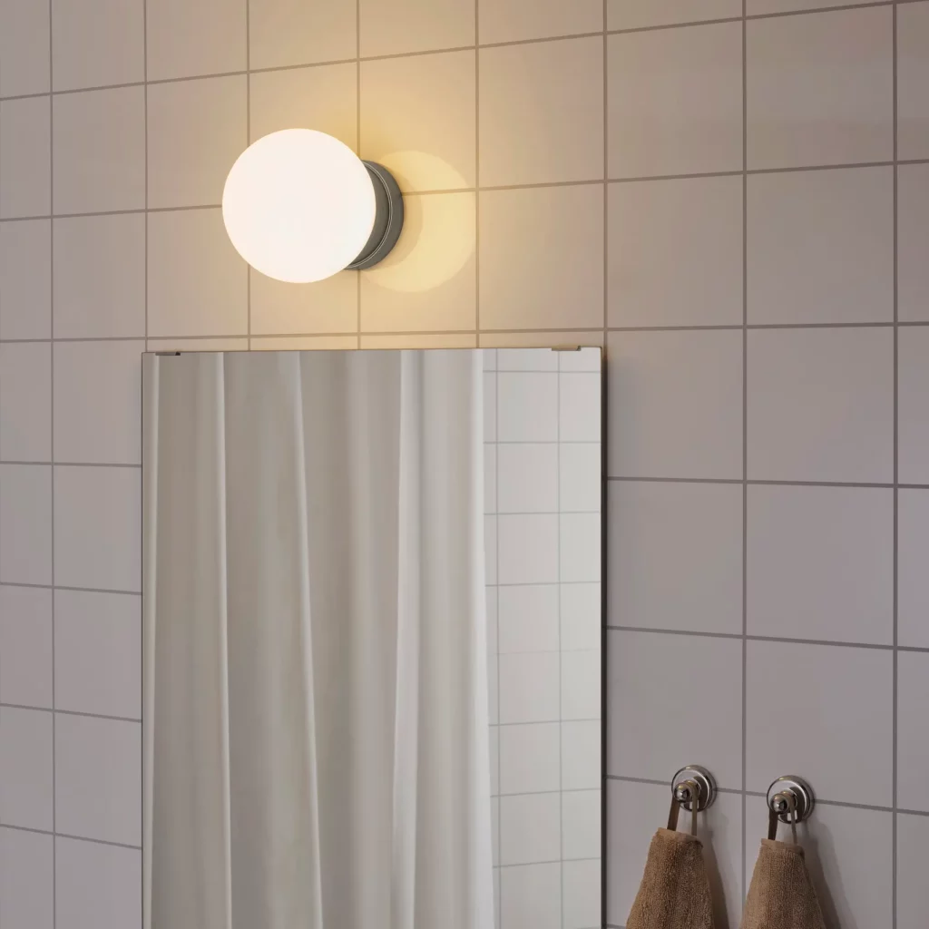
Bathroom
Often a compact and self-contained area, the bathroom offers the safest environment for bold design experiments. It’s a prime candidate for juxtaposing a strongly patterned floor with solid-colored walls. A popular and safe technique involves horizontal division: patterned tiles on the lower half of the wall, with the upper section painted or tiled in a plain color. This prevents the room from feeling claustrophobic while still allowing for visual interest. Bathroom floors must feature a coarse texture for slip resistance, while glossy wall tiles can be used strategically to reflect light, enhancing brightness and perceived spaciousness.
Bedroom
The bedroom is a sanctuary, demanding an atmosphere of tranquility and calm. Harsh contrasts in color or texture should be avoided to promote a restful environment. Wood-effect ceramic tiles on the floor can impart warmth and coziness, creating a natural and inviting feel. These pair beautifully with earthy wall tones such as cream, beige, or sage green. Tiling bedroom walls fully to the ceiling is generally discouraged, as it can create a stark, institutional feel, reminiscent of a hospital corridor rather than a restful haven. Partial tiling, if desired, should be thoughtfully integrated as a wainscoting or accent behind the bed.
Terrace and Outdoor Areas
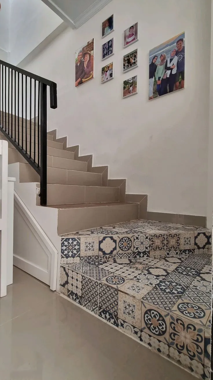
Outdoor spaces are exposed to the elements, requiring tiles with superior durability against heat, cold, and heavy rain. Rough-textured, natural stone-effect ceramics like Andesite or pebble wash are practical and aesthetically suitable, offering excellent slip resistance. A combination of dark Andesite floor tiles with lighter Palimanan stone-effect wall cladding on pillars can create an attractive contrast, mimicking natural landscapes. For outdoor terraces, slightly smaller floor tile formats are often beneficial; the increased number of grout lines aids in water drainage and further improves slip resistance, a critical safety feature for exterior applications.
Current Trends and Harmonious Color Combinations
The contemporary design landscape has seen a significant resurgence in medium-sized tiles, typically ranging from 20×20 cm to 40×40 cm. Their versatility makes them adaptable to various styles, avoiding both outdated aesthetics and overly modern extremes, while remaining relatively easy to install and providing a balanced visual scale.

Terrazzo, with its distinctive speckled appearance created by embedding chips of marble, quartz, granite, or glass into a cement binder, is experiencing a significant comeback. A popular approach is to install a colorful terrazzo floor and then extract one of its dominant aggregate colors to inform the choice of solid-colored wall tiles, creating a harmonious and sophisticated link that ties the elements together.
For enthusiasts of Japandi (a blend of Japanese minimalism and Scandinavian warmth) or pure Scandinavian aesthetics, a palette of medium contrast is often favored. Pairing warm terracotta floors with soft cream or beige walls can imbue a space with a profound sense of warmth and ‘homey’ comfort, characteristic of these design philosophies which prioritize natural materials, light, and functional simplicity.
Fatal Design Mistakes That Impair Visual Comfort
While the pursuit of creative design is commendable, certain tile combination choices can lead to visually jarring and uncomfortable results, diminishing the overall appeal of a space.
A cardinal sin in tile design is the simultaneous deployment of two busy patterns of identical scale within a confined space. Large floral patterns on the floor colliding with complex geometric motifs on the walls will inevitably induce visual dizziness and discomfort, making the room feel smaller and chaotic. The eye struggles to find a resting point, leading to sensory overload.
Overlooking the subtleties of color temperature is another common pitfall. Pairing cool-toned bluish-white marble (with its inherent cool undertones) with warm, yellowish-cream walls (with warm undertones) can make the cooler tiles appear dull, aged, or ‘off,’ creating an unsettling visual dissonance rather than a harmonious blend. Maintaining consistent color temperatures across surfaces is vital for a cohesive look.
The alignment of grout lines, though seemingly minor, significantly impacts visual flow. Installing rectangular floor tiles longitudinally while wall tiles are placed transversely without a clear design rationale results in jarring, misaligned lines that disrupt the eye’s natural progression. Precision in grout line alignment, or a deliberate contrast, is essential for a professional finish.
A final, frequently observed error is the installation of wall tiles to an arbitrary height, often half-way up the wall, creating an unbalanced and awkward proportion. This ‘half-tiled’ look can make a room feel incomplete or visually cut off. It is generally advisable to tile fully to the ceiling, creating a dramatic, clean statement, or to a defined architectural boundary, such as a wainscoting height (approximately one-third of the wall), to achieve a more deliberate and aesthetically pleasing outcome.

Technical Guidelines: Size, Grout, and Proportion
Beyond aesthetics, technical specifications play a crucial role in tile selection and installation, impacting both the visual outcome and the practical longevity of the tiled surfaces.
The physical size of tiles profoundly influences the perceived spaciousness of a room. Larger floor tiles, by minimizing the number of grout lines, create a more expansive and less cluttered appearance, contributing to an open and airy feel. This is a common strategy employed by designers to make smaller rooms appear more generous.
A fundamental rule of proportion, often cited by architects, dictates that wall tile sizes should ideally be equal to or smaller than floor tiles. Installing oversized wall tiles (e.g., 60×120 cm) above smaller floor tiles (e.g., 40×40 cm) can visually destabilize the room, as the floor should logically provide a solid, foundational base that appears capable of supporting the structure above.
Grout color is not merely functional; it’s a powerful design tool. For a seamless, monolithic surface where the tiles appear to merge into one continuous plane, select a grout color that precisely matches the tiles. Conversely, a contrasting grout color can be strategically used to accentuate the individual tile shapes and patterns, adding a graphic element and highlighting the tessellation.
Grout width is determined by tile type. Precision-cut, rectified tiles, which have sharp, uniform edges, allow for minimal grout lines (typically 1-2 mm), creating a very modern and sleek appearance. Non-rectified tiles, which have slightly rounded or irregular edges, require wider grout lines (3-5 mm) to accommodate variations and ensure a level surface, often lending a more rustic or traditional feel.
Material Selection Based on Area and Durability
Different ceramic and porcelain types possess distinct durability profiles, making material selection critical for long-term performance, safety, and maintenance in specific areas.
Granite or homogeneous tiles (often porcelain tiles that are consistent in composition throughout their thickness), known for their high density, low porosity, and scratch resistance, are indispensable for high-traffic zones like living rooms, hallways, and commercial spaces. Their robustness ensures longevity and maintains aesthetic integrity under heavy foot traffic.

Conversely, wall surfaces do not bear foot traffic or heavy impact. Standard ceramic tiles (often referred to as ‘red body’ tiles due to their clay composition) are significantly more economical and perfectly adequate for wall applications. Their lighter weight and easier cutting properties also simplify installation. This allows homeowners to allocate a larger portion of their budget to higher-performing floor materials, optimizing costs without compromising quality.
The impact of natural light, particularly direct sunlight, must also be considered. Highly glossy floor tiles in rooms with direct afternoon sun exposure can create uncomfortable glare, making the space less visually comfortable. Furthermore, reflective surfaces can contribute to an undesirable increase in ambient room temperature due to light reflection, impacting energy efficiency. Matte or satin finishes are often preferred in such sun-drenched areas.
Implementing Transition Accents for Refined Spaces
The junction between floor and wall need not be a