InteriorDesign.ID – The prevailing wisdom in interior design is undergoing a significant paradigm shift, particularly concerning flooring choices for smaller living spaces. Far from the outdated belief that small rooms necessitate small tiles, leading design professionals now champion the strategic application of large format tiles as the most effective method to create an illusion of expansive space. This approach capitalizes on visual psychology, minimizing distracting grout lines to foster an uninterrupted flow that tricks the eye into perceiving a much larger area. Homeowners are increasingly encouraged to embrace tile sizes such as 60×60 cm or even 80×80 cm, irrespective of their living room’s dimensions, to unlock this transformative visual effect.
The Evolution of Flooring Aesthetics and Spatial Perception
For decades, a common misconception persisted in home design: small rooms demanded small tiles to maintain perceived balance. This notion, however, inadvertently led to interiors that felt cluttered and visually cramped. Small tiles inherently introduce a multitude of grout lines, creating a grid-like pattern that fragments the floor surface. This accumulation of visual interruptions makes the floor appear "busy" and restricted, causing the brain to register the space as smaller and more confined. Modern interior design, driven by a desire for minimalism, fluidity, and open-plan living, seeks to eliminate such visual clutter. The need for seamless, uninterrupted surfaces in compact environments has propelled large format tiles to the forefront of contemporary flooring solutions. The choice of floor dimensions is not merely aesthetic; it fundamentally dictates the long-term ambiance of a home. A misstep in this selection can lead to a perpetually cramped feel and, more practically, wasted renovation expenses. A deeper understanding of how flooring impacts visual perception is crucial before material selection.
Unveiling the Visual Psychology of Large Format Tiles in Compact Spaces
Our visual system instinctively tracks boundaries and lines on any surface we encounter. Upon entering a room, the eye’s natural tendency to follow these demarcation lines directly influences our spatial judgment. The more lines present on a floor, the more frequently our gaze is interrupted, creating a sense of visual obstruction and confinement.
Consider a narrow living room tiled with 30×30 cm or 40×40 cm ceramic tiles. The sheer volume of intersecting grout lines creates a dense, checkered pattern that visually "boxes in" the space. These lines act as barriers, preventing the eye from sweeping across the entire floor. Consequently, the brain rapidly concludes that the room is small due to the perceived density and fragmentation of the floor area.

In stark contrast, large format flooring drastically reduces the number of these visual interruptions. A floor laid with large tiles, especially those with minimal grout lines, appears as a single, cohesive canvas flowing seamlessly from one corner to another. This unbroken surface fools the eye into perceiving an extended, continuous area, effectively making the room feel significantly larger, often by as much as twofold. The visual effect is akin to viewing a vast landscape without a fence in the foreground versus one peppered with numerous small obstacles.
Contemporary architectural and interior design practices increasingly favor even larger dimensions. Many modern residences are transitioning from 60×60 cm tiles to expansive porcelain slabs measuring 120×60 cm or even larger. These elongated pieces offer an additional advantage: when laid parallel to the longest dimension of a room or corridor, they can visually stretch the room’s proportions, compensating for inherent architectural limitations and creating a sense of expanded depth and length.
The Strategic Sacrifice: Prioritizing Expansiveness Over Intricate Detail
While selecting large format tiles for smaller rooms is a powerful design tool, it often necessitates a thoughtful compromise on certain aesthetic details. To maximize the illusion of space, designers advise against intricate patterns, heavily textured surfaces, or mosaic-style flooring. The guiding principle here is to establish the floor as a neutral, understated backdrop. The goal is to prevent the floor from competing for attention with bold vintage patterns, striking colors, or dramatic textures.
Instead, the floor should recede, allowing the eye to focus on architectural features, wall treatments, or carefully curated furniture pieces. The outcome is an interior that feels unburdened and breathable. The inherent simplicity and clean lines of plain, large format tiles serve to highlight minimalist furnishings and decor, ensuring that the room does not feel overwhelmed or visually chaotic by conflicting patterns and elements.
It is crucial to note that the installation of these substantial tiles demands a perfectly level subfloor, or screed. Achieving this often requires additional investment in professional leveling services. While this might incur an extra cost upfront, the dramatic and lasting visual impact of a flawlessly laid large format floor is widely considered a worthwhile investment, contributing significantly to the overall perceived quality and spaciousness of the home.
Expert Perspectives: Why Architects and Designers Champion Large Tiles

The architectural community consistently advocates for large format tiles due to a deep understanding of human visual perception and its impact on spatial experience. According to leading architects, our perception of a room’s size is profoundly influenced by the continuity of its floor surface. A space fragmented by numerous floor lines is instantaneously registered by the brain as constrained.
The floor, after the ceiling, represents the second largest continuous surface within a room that immediately captures our attention. Disrupting this expanse with a grid of small tiles undermines the room’s integrity and visual coherence. Modern architectural design emphasizes creating seamless transitions and open vistas, which large format tiles inherently support.
Architects also highlight the importance of "rectified" tiles—those with precisely cut, sharp edges—which allow for significantly tighter grout lines, often as narrow as 1-2 mm. This minimal gap is paramount to achieving the desired uninterrupted surface effect, effectively manipulating the perception of room size. Furthermore, the selection of large granite or porcelain tiles in compact homes often correlates with a higher resale value. Prospective buyers are immediately impressed by the premium aesthetic and the palpable sense of spaciousness, signaling a well-thought-out, modern interior.
Tailored Tile Selection: A Room-by-Room Guide for Optimal Impact
A one-size-fits-all approach to tile sizing rarely yields optimal results, especially in smaller homes. The proportion and type of flooring must be carefully adapted to the specific function and characteristics of each zone within the house.
Open-Plan Living and Family Rooms: These areas present the prime opportunity to maximize the illusion of space. Large format tiles, at a minimum of 60×60 cm, are highly recommended. For those with a slightly larger budget, 80×80 cm homogeneous tiles can instantly imbue a sense of luxury and grandeur. Crucially, these tiles should be installed continuously, without any visual breaks or thresholds, into adjacent family areas. This uninterrupted flow merges two distinct zones into a single, expansive field. Light and neutral colors such as white, cream, or light grey are ideal, as they reflect light and further enhance the feeling of openness. A slightly glossy finish on the tiles can also contribute significantly by bouncing natural light across the room, brightening every corner.
Kitchens and Dining Areas: In minimalist homes, kitchens are often densely packed with cabinetry. While large tiles remain effective, safety is a key consideration. A 60×60 cm tile with a matte finish provides an excellent balance between creating a spacious illusion and ensuring a non-slip surface for active areas. A common design pitfall is to differentiate the kitchen floor with smaller, patterned tiles (e.g., vintage cement tiles). This visually severs the kitchen from the main living area, making it appear like a separate, confined box. Instead, extend the large format tiles from the living room directly into the kitchen. Any desired decorative flair can be introduced through the backsplash (kitchen wall), keeping the floor surface unified and clean.

Narrow Hallways and Connecting Passages: Hallways can be challenging for large square tiles due to the extensive cutting required along the edges. Here, rectangular plank tiles, often mimicking wood or stone, with dimensions like 15×60 cm or 20×100 cm, are superior. These tiles should be laid lengthwise, following the direction of the hallway. The elongated lines will draw the eye forward, making the corridor feel longer and more proportionate. Avoid laying them crosswise, as this creates a "ladder" effect that visually chops the length of the hallway.
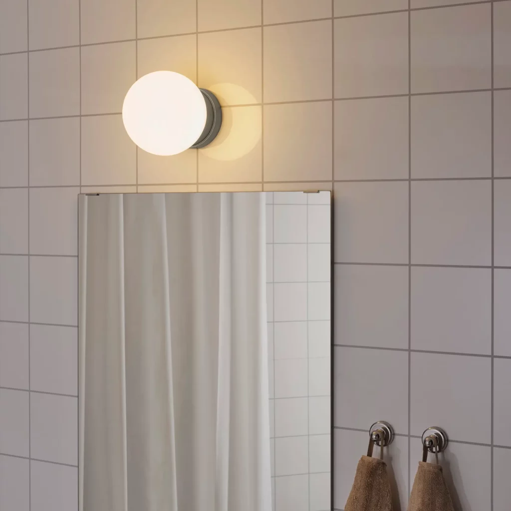
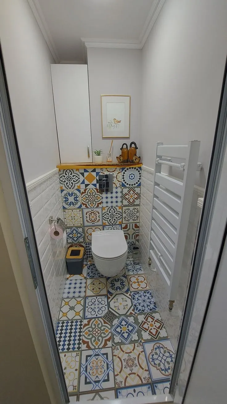
Bathrooms: Bathrooms are frequently excluded from the large tile rule due to concerns about slipperiness. However, large format tiles with a matte or rustic texture are perfectly safe for wet areas. Using 40×40 cm or 60×60 cm tiles can transform a small bathroom into a luxurious, hotel-like amenity. Moreover, the closely packed grout lines of smaller 20×20 cm tiles are notorious for trapping soap scum and mildew, making cleaning a tedious task. Large tiles, with their minimal grout, significantly reduce cleaning time and effort. Professional installers are adept at creating the necessary slopes for drainage even with larger tile formats, ensuring proper water runoff.
Mastering Aesthetic Choices: Color, Texture, and Style Integration
While size forms the structural foundation, the choice of color and texture refines and perfects the overall outcome.
Color Palette and Light Reflection: Light, neutral colors are universally recommended for creating an expansive feel. White, off-white, light grey, and soft beige tones maximize light reflection, brightening the room and blurring the boundaries between walls and floor. Darker colors, while sometimes used for dramatic effect in larger spaces, tend to absorb light and make compact rooms feel smaller and heavier.
Texture and Finish: The finish of the tile also plays a critical role. A polished or semi-gloss finish can enhance light reflection, contributing to the open feel. However, in high-traffic or wet areas like kitchens and bathrooms, a matte or slightly textured finish is preferable for slip resistance. Avoid highly patterned or visually busy tiles, as they can reintroduce the visual clutter that large format tiles aim to eliminate. Subtle veining (e.g., marble look) or a consistent, understated texture (e.g., concrete look) can add sophistication without overwhelming the space.
Integrating with Design Styles:

- Scandinavian Style: This aesthetic thrives on light, airy spaces. Large, pale, matte tiles (e.g., 60×60 cm off-white porcelain) combined with light wood furniture and ample natural light create a soft, diffused ambiance that feels inherently spacious.
- Japandi Style: For the serene elegance of Japandi design, rectangular porcelain tiles (e.g., 20×120 cm) mimicking light wood grains are an excellent alternative to vinyl flooring. Laid in a linear fashion, they extend the visual length of the room while imbuing a sense of warmth and natural calm.
- Modern Classic: Homeowners favoring a timeless, luxurious look can opt for 80×80 cm homogeneous tiles with a Carrara marble effect. The subtle grey veining, flowing almost uninterrupted across the large format, delivers an understated elegance and premium feel, even in more modest spaces.
Precision Installation: The Art of Deceiving the Eye
The effectiveness of large format tiles in creating an illusion of space is highly dependent on meticulous installation. The laying pattern and the choice of grout color are critical factors that can either enhance or undermine the desired outcome.
Laying Patterns for Visual Manipulation:
- Straight Lay: The most common and effective pattern for large tiles in creating seamless continuity. Tiles are laid in straight, parallel lines.
- Diagonal Lay (45-degree angle): This pattern is particularly effective for square or oddly shaped rooms, or those with rigid, box-like dimensions. By forcing the eye to follow longer diagonal lines that stretch across the room, it effectively broadens the perceived width and depth.
- Linear Lay (for planks): As discussed for hallways, laying rectangular planks parallel to the longest dimension of a room or corridor elongates the space.
The Critical Role of Grout: The color of the grout must be chosen to match the tiles as closely as possible. Using a contrasting grout color, such as black grout on white tiles, will immediately re-emphasize the grid pattern, destroying the illusion of a boundless surface. The goal is to make the grout lines virtually disappear. Professional installers utilize tile spacers to ensure consistent, minimal gaps between tiles, which is crucial for a flawless finish.
Common Pitfalls to Avoid in Tile Selection and Installation
Avoiding fundamental errors is as crucial as selecting high-quality, aesthetically pleasing tiles.
- Ignoring Subfloor Preparation: This is perhaps the most critical error. Large format tiles are unforgiving of uneven surfaces, leading to lippage (uneven tile edges), cracking, and premature failure.
- Choosing Contrasting Grout: As highlighted, contrasting grout negates the spatial benefits of large tiles. Always opt for a grout color that closely matches or is slightly lighter than the tile.
- Overly Busy Patterns: While large tiles can handle some pattern, complex or highly contrasting designs can overwhelm a small room, making it feel visually chaotic.
- Inadequate Professional Installation: Laying large format tiles requires skill, precision, and specialized tools. DIY attempts or using inexperienced installers can lead to costly mistakes and a compromised aesthetic.
- Neglecting Skirting/Baseboard Integration: The plinths around the room are an extension of the floor’s visual impact.
Maintenance and the Subtle Art of Skirting

A significant practical advantage of large format tiles is the reduction in grout lines, which are notorious for accumulating dust, dirt, and absorbing spills. Fewer grout lines translate to significantly less effort required for routine cleaning and maintenance. Many large format porcelain and granite tiles are factory-treated with stain-resistant coatings, making spills like coffee or wine easy to wipe away without leaving permanent marks. This ease of maintenance contributes to the long-term pristine appearance of the floor, preserving the illusion of spaciousness.
The overall visual coherence of a room is also heavily influenced by the skirting boards, or plin. Skirting that is excessively high, thick, or in a contrasting color can visually "cut off" the wall, making the room appear shorter and causing the ceiling to feel lower and more oppressive. To maintain and enhance the expansive feel created by large tiles, the skirting should be discreet and integrated.
Ideal solutions include flush skirting (level with the wall) or skirting with a shadow gap (a small recess that makes it appear to float). If these custom options are beyond budget, choose ceramic skirting that perfectly matches either the floor tiles or the wall color. Crucially, keep the height of the skirting to a maximum of 7 cm. If the floor has a wood-look tile, match the skirting color to the wood tone. These subtle design tricks create a visual continuity where the floor appears to flow seamlessly up the wall, further contributing to an extra sense of openness and verticality.
By understanding and applying these principles, homeowners can transform even the most compact spaces into interiors that feel effortlessly spacious, modern, and aesthetically refined, ultimately enhancing both daily living and long-term property value.